HANDS-ON: Two-tone with a twist — the Girard-Perregaux Laureato in titanium and pink gold
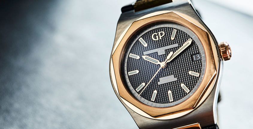 One of the most impressive collections we saw at SIHH 2017 was that of Girard-Perregaux, dominated by the sporty, ’70s-inspired Laureato collection. And while most of the Laureatos walked a pretty established product path — a top-end tourbillon, 42 and 38mm models in a few dials and case materials, as well as smaller, diamond-decked women’s models — one model stood out, both in terms of style and construction. I’m talking, of course, about the watch in the above picture, a 42mm two-tone Laureato in a bi-metallic case. And while two-tone is hardly unusual (especially this year, when it’s launched into legit ‘trend’ status), you don’t see too many watches in a mix of precious pink gold and technical titanium. Which, looking at this piece, is a little bit of a surprise, because, boy, does the combo work. Both metals have been given the brushed treatment, resulting in a slightly more muted, matt look that especially suits the grey titanium. There’s a version with fully integrated two-tone bracelet … that is, as they say, a strong look, but there’s also this croc-equipped option, which is nice and dressy. Of course this Laureato isn’t just a pretty case. It’s also got a dial to…
The post HANDS-ON: Two-tone with a twist — the Girard-Perregaux Laureato in titanium and pink gold appeared first on Time and Tide Watches.
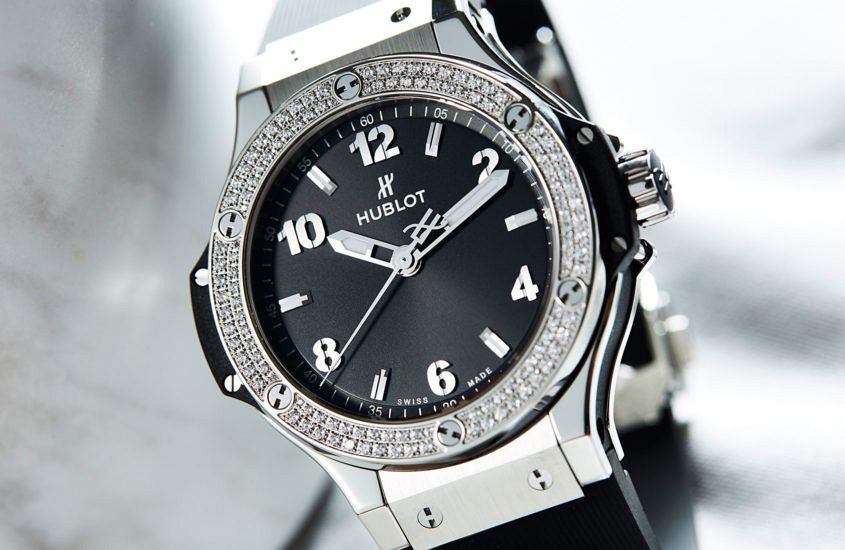 Let’s face it, women are not buying women’s watches necessarily; they want a watch that does not discriminate, with a bit of bravado, whether by means baller or boxer. That said, the full diamond effect in every direction, of the kind that was Hublot’s 2 million Euro 44mm 145-ct Big Bang behemoth, with its baguette-laden strap, case and dial, is too chunky a statement for most women. Well, with the exception of the wife of a Vegas casino owner, who naturally felt right at home in it and swiftly claimed hers. I prefer to make like a Mayweather cornerman, not exactly all-retiring, more the fall-back of outlandish. And this ladies 38mm Big Bang Steel Diamonds has just the right proportion of diamonds to monochrome styling and height on the wrist to make that spot attainable, while It feels more unisex in fact. The black rubber Hublot hallmark strap — in this case finely lined, though the tactile sensation approaches suede rather than any noticeable ridging — sets the sports luxe tone. Followed nimbly by the enduring industrial, tool watch details of the Big Bang’s multi-material, polished and matt case that sits in eminent view on the wrist, with its six exposed titanium screws…
 Today we talk to the globetrotting and glamorous Matt Hranek about travel, watches, the perfect travel watch and his just-released book, A Man & His Watch. Tell us about yourself, what does a typical week look like for you? Well, let’s start with the day. I wake around 6.30am, robe goes on, dogs are let out to the garden, and the coffee pot goes on (a drip dark roast). Then I start my day by picking out the watch that speaks to the day for wardrobe, activity or feeling I have. The week could involve travelling on assignment for Condé Nast Traveler (where I am the Luxury Editor, and often shoot for them or edit/produce stories) or, if I am in the city, I am taking meetings and lunches with clients and brands, or general “flaneuring”. So, Matthew, what’s your daily watch, and why? Tough to say — I have a dozen or so that I choose from. That watch is chosen based on wardrobe, activity or general aesthetic feel. I will usually wear that choice for at least the week, but I can be fickle. Browsing through your feed, I can see a clear penchant for all things vintage, especially…
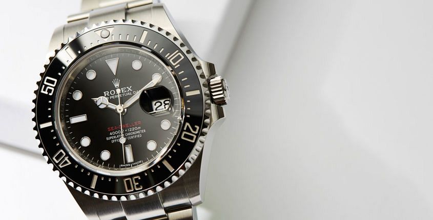 In the weeks leading up to Baselworld 2017, the speculation as to what Rolex would be releasing was rife. With astute watch collectors quickly pointing out that 2017 marked 50 years of the Rolex Sea-Dweller, the community braced for an anniversary edition. We all know — and love — that Rolex celebrates iconic anniversaries, and more often than not it’s a sophisticated touch here and there. Think back to the Rolex Submariner (ref 16610LV), where we saw a green bezel, or the more recent Rolex Day-Date 40 (60th anniversary Edition), with a stunning green dial. For all that, they’re instantly recognisable: Rolex are subtle — one of their core strengths is to design and manufacture timeless wristwatches. A Submariner from 1970 looks just as good as a current production Submariner, and that’s because Rolex doesn’t do rapid change. They move to the beat of their own drum. So, when the doors to the fair opened, attendees (myself included) swarmed to the Rolex booth, fighting to get the first glimpse of exactly what this would be. Glistening in the window sat the brand new 50th Anniversary Sea-Dweller. Since that initial exciting glimpse, I’ve managed to spend a bit more time with the new Sea-Dweller reference…
 The past month involved a fair bit of travel, a lot of coffee, and some very, very impressive timepieces. So, without any further ado, here’s what went down. First up, I found myself on a quick trip to Sydney, where I bumped into a fellow Andy (@A_Zhangerator), who just so happened to be rocking an impressive Patek Philippe Travel Time. Andy loved how dynamic the dial is on the Travel Time, and we both agreed it’s hard to photograph — it’s much better in person. For an international businessman like Andy, this is an excellent choice, though his next purchase is likely to be another Richard Mille. Whilst up in Sydney, I also snuck in a quick whisky sour with Carson Chan, who was in the country for work. It was a long time between drinks, and the last time we caught up was back in Basel earlier this year. Carson was then wearing his Discommon Discautavia; now, an Omega Flightmaster, in really neat condition. Being the Head of Mission at the Fondation de la Haute Horlogerie, Carson’s always playing with compelling timepieces — and his Flighty did not disappoint. Back in Melbourne, old friend QT (@Mr_Q_T) happened to be…
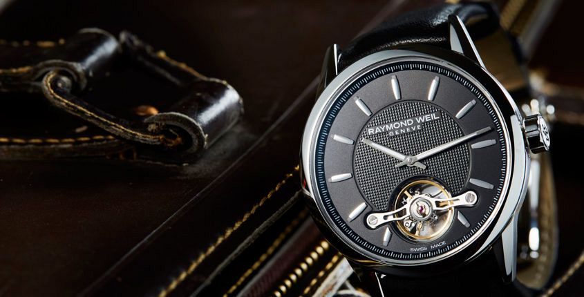 Raymond Weil, one of the few independent, family-owned operations in the Swiss watch industry, marked their 40th birthday this year. And while I’m sure there was cake, and perhaps even champagne, the best part of the celebrations has to be the Calibre RW1212. This automatic movement, with distinctive open-heart escapement, is unique to Raymond Weil, designed in-house and made by Sellita. RW1212 marks the first time Raymond Weil have dipped their toes into the deep (and often murky) waters of in-house movements, and it’s a testament to the brand that they’ve been transparent about the movement’s design, development and construction, and they’ve made a mechanism that meets their needs, in that it’s a solid, robust automatic, with a touch of drama, thanks to the design of the escapement, which has been positioned in such a way to allow an uninterrupted view from the dial-side, suspended via a diamond-polished double bridge, a look that evokes (very consciously, I suspect) the placement of a tourbillon. While closer inspection (of the watch, or the price tag) reveals that the RW1212 isn’t a tourbillon, the effect is somewhat the same — allowing the user to see the beating heart of their watch. It’s a…
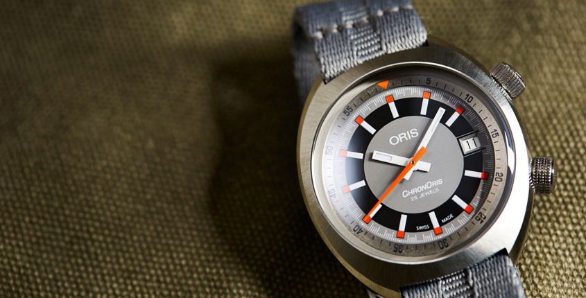 The story in a second: Disco might be dead, but the ’70s live on in Oris’ latest re-edition. A decade for experimentation, the ’70s was an era of bold shapes and brightly coloured designs (men’s turtleneck ponchos, anyone?). While many of these experiments should never be repeated (men’s turtleneck ponchos), there are a few special exceptions. One of which is the Oris Chronoris. Released in 1970, it was the brand’s first foray into the world of motorsport and their very first chronograph. Since then, Oris has built a strong stable of auto-themed watches. Maintaining connections to the sport of motor-racing with partnerships including Audi Sport and Williams’ F1 teams. Oris first paid tribute to the Chronoris in 2005, in the shape of a retro-themed chronograph, and once again have honoured the one that started it all, with the release of the Oris Chronoris Date. The case The case of the Chronoris Date takes most of its design cues from its retro predecessor. Barrel-shaped with cut-out 19mm lugs, its rounded curves are fully polished, except for on top where a radially brushed finish creates a dazzling sunburst effect. This effect also draws the eyes towards the wonderfully double-domed AR-coated sapphire crystal, which not only…
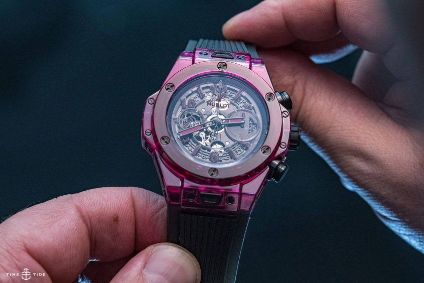 There’s something about the colour red. In nature it symbolises danger, in human culture it’s got a more complex set of meanings: typically passion, strength, desire – emotion writ large. Which is why this glistening red sapphire confection is the logical extension of Hublot’s journey into sapphire. Not only does the vivid case amplify all the natural attributes of the Big Bang case – especially given the contrasting black detailing, but it exaggerates everything that Hublot stands for, not just in terms of design, but also in brand ethos. It’s an audaciously out-there watch, not to many people’s tastes, but it is an undeniably, infectiously fun watch. And, really, isn’t that what matters? Hublot Big Bang Unico Red Sapphire Australian availability and pricing Hublot Big Bang Unico Red Sapphire, limited to 250 pieces, $95,000
 The ’80s were Nerd City, peppered with popped polo shirts and pie-crust collars, Slime, The Breakfast Club, pommes noisettes, Pop Rocks candy and brine shrimp pets masquerading as Sea-Monkey kits. All items the young cast of the addictive, nostalgia trip that is Stranger Things no doubt had to get across when their director asked them to watch The Goonies and Stand By Me in pre-production. Against this neon, fad-filled haze emerges the ’80s saving graces – the best pop music in history and watches that either embraced new technology or new money. Here’s 11 (see what we did there) watches we’d be happy to see in season two. Swatch Watch – 1983 The simple plastic quartz Swatch flipped the way we looked at watches on its head, bringing a sense of play to the fore, and decreeing them style consumables. It was a democratic move away from Swiss watches predicated on careful craftsmanship to be cherished for a lifetime. Swatch meant there was a colour and design for every personality. Casio G-Shock (DW-5000C) – 1983 The durability of the game-changing Casio G-Shock managed to avoid a prohibitive price bracket while earning cult cool status. Its engineer, Kikuo Ibe, wanted a…
 Now, if you’ve watched my review of the Tudor S&G you’ll know that I’m #team2tone all the way, but the thing is, I don’t *really* know how to wear it. I mean, I think I’d be OK in more formal settings — just pair it with a suit and away you go, but in every other part of my life — not so sure. I’ve got two-tone anxiety, and I’m sure I’m not the only one. Because, much as we’re all aware that the mix of precious and plain metals is, once again, en vogue, our awareness of it, and how to wear it, is still stuck in the 1980s. So I thought it was time to bring in the big guns, in the form of David Meagher. David, aside from being editor of The Australian’s WISH magazine, is a bastion of good taste and a sartorial safe harbour. He’s also of a vintage to have experienced the two-tone trend last time it was cool, so he’s in a unique position to tell us how it was done and how it should be done. Now David, I don’t think it’s too forward of me to suggest that you might have…