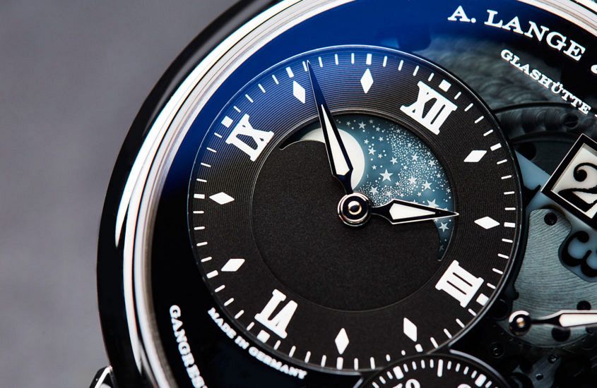
 Think of Lange’s colour palette and the word ‘sober’ probably springs to mind. Or restrained. Limited. Calm. Muted. Subdued. Discreet. Anything but vivid and daring. Now, let’s for a moment think not of A. Lange & Söhne but only of the colours: white, black, grey (dials); black again, brown, (straps); pink gold, white gold (platinum looking more or less the same), a rare dash of yellow gold. Yes, there are some exceptions (we’ll come to those later), but put Lange’s entire catalogue of the past 20-plus years into a flip-book and that’s pretty much what you get. Based on those limited ingredients, if it were a cookery book you could be looking at the plainest meat-and-potatoes menu this side of a 1960s boarding school dinner. If it were another watch company … Well, sadly, the world is swamped with insipid, play-safe watches that are about as easy to distinguish from each other as boiled potatoes. But give those restricted ingredients to Lange and we get watches with richness and liveliness, with immediately recognisable character and great presence. It’s a remarkable trick. How does Lange do it? Let’s look back at the ‘famous four’ watches that announced the rebirth of the…
The post INSIGHT: Designing A. Lange & Söhne – part 4, colour, material and finish appeared first on Time and Tide Watches.
Continue reading ‘INSIGHT: Designing A. Lange & Söhne – part 4, colour, material and finish’