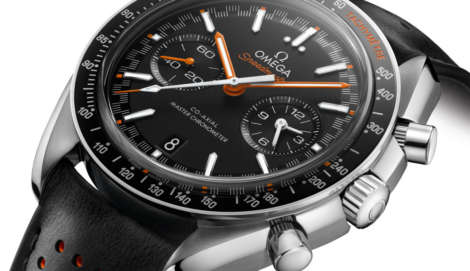
INTRODUCING: Bell & Ross meets brutalism with the BR 03-92 Horolum
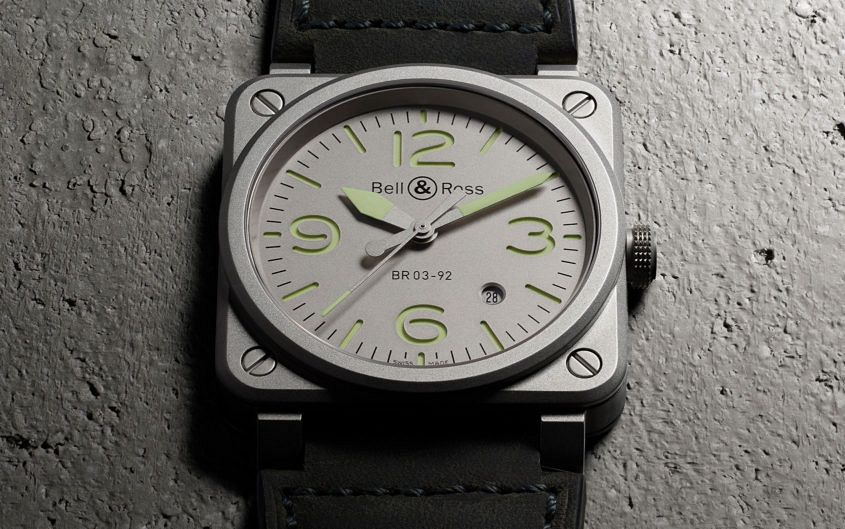 Bell & Ross’s latest take on its classic square draws inspiration not just from aviation, but also – far less predictably – from the realms of art and architecture. The BR 03-92 Horulum is a monochrome monolith of a watch, a 42mm bead-blasted case with matching sandwich dial and complementary pale green C3 Superluminova hands and markings. On this occasion, the aeronautical tie-in isn’t quite what you might expect. It’s not a tribute to the latest generation strike fighter or specialised avionics instrumentation. No, Bell & Ross has gone for something far more down-to-earth this time around: the humble tarmac. The matt grey colour is inspired by the concrete of the runway, with the green lume evoking the lights that guide pilots when landing at night. So far so Bell & Ross. But where do art and architecture come in? Well, the broader design inspiration for the Horolum comes from the Bauhaus (the German design school, not the ’80s goth band), whose utilitarian take on modernist design was hugely influential in the 20th century. Conveniently, it’s also an approach that fits neatly with the tool-like aesthetic of the watch. For the past few years the word doing the rounds of publications such as Monocle and Cereal has…
The post INTRODUCING: Bell & Ross meets brutalism with the BR 03-92 Horolum appeared first on Time and Tide Watches.
 Bulgari has unveiled some of its latest collection in advance of Baselworld, and we were lucky enough to get our hands on a few key pieces. One model that particularly took our fancy was this crimson and black take on the Octo Ultranero. The changes on this latest version of the Octo are purely cosmetic – it’s still a 41mm black DLC-treated steel case rated to 100m, powered by Bulgari’s in-house BVL 193, mounted on sporty black rubber strap – but that doesn’t mean it doesn’t have a different story to tell. The dial is black lacquer, polished to a gloss black finish. On top of this, Bulgari has added blood-red indices and hands to the mix. The result is impressively moody, adding a touch of drama to the typically stealthy Octonero. Red is a pretty bold colour choice, typically associated with passion and danger – especially against the slick black backdrop of the Ultranero, but this watch also amps up the sports factor. The rubber strap and primary colour highlight means it doesn’t look out of place in more causal settings – as you can see it wears well with denim – though while I appreciate the contrast of the case and the matt…