INSIGHT: The craft of Van Cleef & Arpels
 Van Cleef & Arpels have long been recognised as one of the world’s most creative high jewellery houses. Taking inspiration from nature, magic and fairy tales, the Parisian Maison creates complex jewels of unusually high technical and design content – so that even the most extravagant pieces have a lightness, charm and wit. In recent years, Van Cleef & Arpels have also become recognised for their artistic and highly creative watches. But it is no mere arriviste in the world of horology. In the 1920s the famously elegant Louis Arpels designed the Ruban (‘ribbon’) watch, with a rectangular case that formed an unbroken line with the links of its gold bracelet. A 1927 pocket watch with a double retrograde display featured a robed Chinese Mandarin on the dial, whose arms indicate the hours on one side and the minutes on the other. Having coined the phrase “Jewels that tell the Time”, Van Cleef & Arpels have always endeavoured to blur the lines between high jewellery and horology. However, a decision made in 2006 has radically changed the Maison’s stature in watchmaking. Stanislas de Quercize, then the CEO, asked Nicolas Bos (Creative Director at the time, Bos succeeded de Quercize as…
The post INSIGHT: The craft of Van Cleef & Arpels appeared first on Time and Tide Watches.
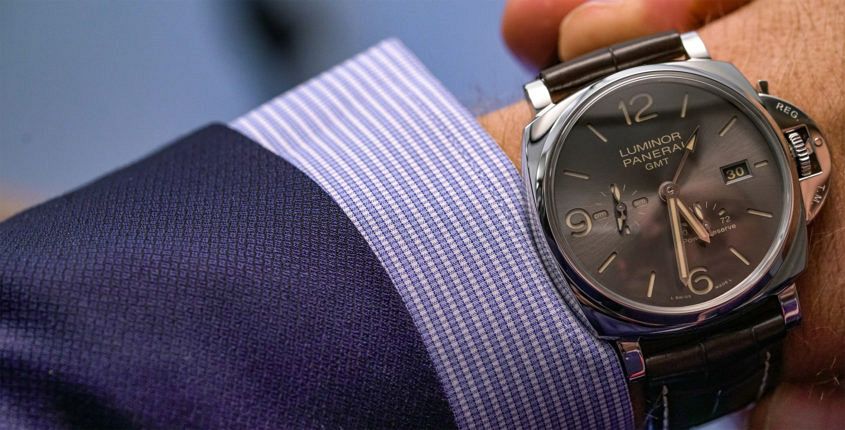 When it came to Panerai’s latest collection, we’ve already covered off how the Luminor Due was the surprise star. And while it’s fair to say the smaller models accounted for a disproportionate amount of the noise, there was strong representation at the larger end of the scales. In particular this watch, PAM 00944, a full-cream 45mm case, which — thanks to its Due status — still slips under the cuff with far more ease than its ‘regular’ Luminor brethren. And, to be honest, this watch is made with suits of the finer cut very much in mind. The polished 316L steel case is, well, polished in every sense of the word, and the croc strap with contrasting stitch is elegant in a way only alligator can be. Then there’s the dial. It’s still the familiar sandwich construction, with bold, stylised Arabic numerals at the cardinal points: a design that would very much be familiar to those wartime divers. But the execution is more civvie than military — not to mention civilised. The luminous material on the markers and hands, as well as the printed details all in a warm, butterscotch hue (quite pleasing); and the main dial material is a…
 Typography matters. The choice of font or type is a more complicated matter than merely the arrangement of letters used and the order in which they appear. It’s something designers and branding specialists know only too well: the sub-textual information communicated through the subtle language of serif, weight and kerning. Take the word ‘apple’, for example. Typically, that arrangement of letters evokes the fruit. Capitalise the ‘a’ and write it in Avenir, a font designed by Adrian Frutiger in 1988, and the meaning instantly morphs to that of the sleekly designed products of the Cupertino giant. The heaviness of this meaning is exacerbated when text is used as logo: think NASA, Coca-Cola or even Facebook. And so A. Lange & Söhne, written in that characteristic curve, which gently follows the line of a round case – surmounting the words Glashütte I/SA – has multiple meanings. A. Lange & Söhne indicates the brand, and the second line speaks to their home (the I/SA is shorthand for ‘in Sachsen’ or Saxony). Factual, literal stuff, but the font Lange have chosen speaks to their identity, and speaks to it in a very interesting way. A. Lange & Söhne is a brand with a…
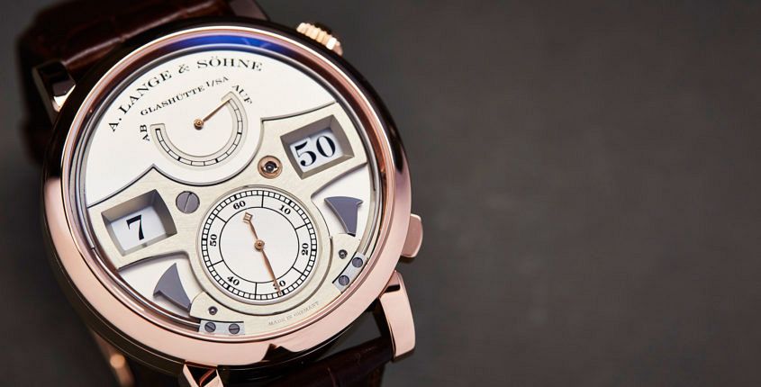 “Money likes silence.” Several years ago, a Russian collector by the name of Nikolai (he prefers not to publish his surname) was telling me why he’s so keen on A. Lange & Söhne, and I was struck by that part of his reply. While he meant it to sum up the ‘stealth’ appeal of Lange’s designs (discreet elegance; the antithesis of vulgarity), it also begged the question: what does make Lange so distinctive? A. Lange & Söhne is not what we think of as a “design brand” (the term suggests something altogether more conspicuous or self-consciously groovy) and yet its design language is not only unmistakable but also an intrinsic part of its being. We live in the Age of Noise: advertising noise, entertainment noise, social media noise – all adding to the general cacophony of daily living. So, given that a Lange watch announces its specialness with a whisper, not a shout, how does it make itself heard? The very quietness of Lange’s design is the answer, I think. A couple of years ago, Paul Tange, a prominent Tokyo-based architect and keen Lange collector, summed up the beauty of Lange’s design to me in the simplest terms: “Aesthetically, the…
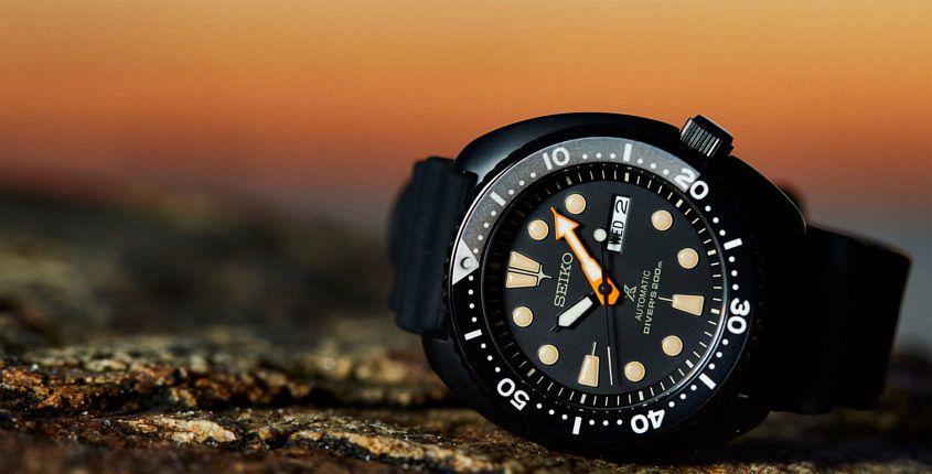 Editor’s note: We originally broke the news of Seiko’s limited edition ‘Black Series’ late last year, and the watches are finally hitting Australian stores (and being rapidly snapped up by all accounts — get in quick). The hero of the pack is, without doubt, this blacked-out version of their popular ‘Turtle’, the SRPC49K. As you will read below, I tried to get the nickname of ‘Night Diver’ to stick, but social media has spoken (as it is wont to do), and declared this model is the Darth Turtle. Whatever you think of the name, there’s no denying that the force is strong with this one. Seiko dive watches are a perennial favourite. They’re tough-as, look the business, and have a history as long and proud as any. Whether it’s the coveted SLA017, or the classic Turtle, they’ve got a strong rep, and cult following. The Seiko faithful are going to be very happy with this latest limited edition – the SRPC49K, which we’ve taken the liberty of nicknaming ‘the night diver’ (I’m really hoping this catches on). We’re going to let these stunning pictures do most of the talking, but here are the details we have so far: The SRPC49K is a…
 For over 30 years the Portofino has been amongst IWC’s dressiest offerings, with a rounded Lépine-inspired case, and elegant, elongated Roman numerals. So it comes as no surprise that the line has a prominent place in IWC’s 150th anniversary collection. And while there’s simpler offerings, such as the Automatic and the Chronograph, our eyes (and hearts) were drawn to the more complex Hand-Wound Moon Phase Edition “150 Years”. Looking at the watch its easy to see why. 45mm of rich red gold protecting the calibre 59800, with moon phase and power reserve, all topped off with that deep, deep blue dial, with gold details (like that oh-so-romantic moon). It might not be a dress watch in the typical, diminutive sense, but there’s no denying its a showstopper. IWC Portofino Hand-Wound Moon Phase Edition “150 Years” Australian pricing and availability IWC Portofino Hand-Wound Moon Phase Edition “150 Years in red gold, limited to 150 pieces, $34,200.
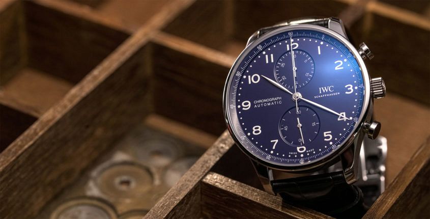 IWC’s Portugieser line is, in Australia at least, one of their most popular — and, of all the models, one of the perennial favourites is the classically handsome Portugieser Chronograph. Which is why we’re particularly interested in the Portugieser Chronograph Edition “150 Years”. Quick recap in case you’ve been living under a rock for the last week or so: This year, IWC turns 150 (and we don’t mind saying that they’re looking quite good for their age), and one of the ways they’re celebrating the big occasion is with watches. Specifically, 27 special limited editions, released across five key lines. Now, the Portugieser Chronograph may lack the high-end clout of the Constant Force, or the novel display of the Pallweber, but it is, nonetheless, an important model. Like all the models in this jubilee collection, the chrono is offered in two special, heavily lacquered dials in blue or white that do a fine job of evoking the look of enamel. There are not precious metal options; only steel, and both come on a black alligator strap. So, nice dial aside, what makes this watch special? Well, the movement. Typically, Portugieser Chronos have closed caseback, as they’re powered by a Valjoux. Not…
 My art deco admiration and monochromer habits have always had me on Team Casablanca considering Franck Muller’s selections. But it is party season after all, so I am easing up on the classic palette and eyeing off a completely different proposition. The Color Dreams collection is a parade of watches with one exuberant mission: to liven up proceedings. There’s nowhere to run for introverts with the complete spectrum of appliqué, exploded rainbow numerals — each one in a different colour — the dial is bolstered with as saturated a hand-stitched crocodile strap, from as wide a vista as the hours’ tones. On this occasion I’ve got the gloss orange croco strap. Pink and red are winsome alternatives but the green option would also be a fine match. At a quick first glance, the dial’s all childlike playfulness, but closer inspection reveals that Muller’s hallmark sunburst dial, with its lacquer and mother of pearl, has a depth to it, by means of a reference to the Crazy Hours collection. There is a ghosting of smaller, guilloché cut or embossed numerals around and across the dial, but just underneath the main numerals; the hours display time in the customary correct order though. This…
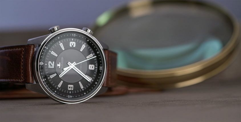 The Polaris – as Andy recently informed us – is one of those truly iconic watches conceived in a golden age, not just of watchmaking but also of global exploration. This year the Polaris got the nod for the remake and revamp treatment, being offered in five new models, starting with the deceptively simple Polaris Automatic. The uncomplicated, no fuss Polaris Automatic is the entry-level ticket to JLC’s brand new sports watch collection. The dual crowns hark back to the original, but this is no Memovox. Instead, one crown governs time-setting and the other looks after the internal bezel. At first glance, the dial is uncomplicated, devoid even of a date. But look closer and you notice the mixture of sunray, grained, and opaline treatments, with applied numerals and trapezoidal hour markers filled with luminous material that matches the hands. It’s exactly the sort of accomplished offering you’d expect from JLC, and it elevates the Polaris Automatic above the typical sports-casual fare. The dial is offered in black and (our pick) ocean blue. Inside the 41mm steel case beats the LC Caliber 898/1 automatic movement with a power reserve of 40 hours, tested for 1000 hours and looking good through…
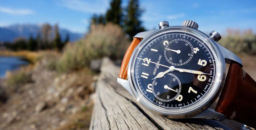 According to Montblanc’s Head of Watches, Davide Cerrato, the 1858 collection — the star of their SIHH 2018 lineup — is a “very important second sports line, one that really extends the offer of Montblanc, an offer that before was completely focused on classical watches”. At the core of the 1858 collection’s identity is its vintage style. Cerrato explains: “The vintage look refers to the first Minerva military watch. There’s the SuperLuminova, the cathedral hands, the domed sapphire crystal, the simple – but very strong – case.” All these points are very much in evidence on the 1858 Chronograph, which, like much of Montblanc’s lineup, makes a compelling value proposition. Montblanc 1858 Chronograph steel with black dial (ident 117835 – 117836) First up, there’s the steel-cased, black-dialled option. The dial isn’t matt, instead it has a subtle sunburst finish that adds a touch of class. Design-wise, Montblanc hasn’t messed with the formula too much: bi-compax layout, with spartan Arabic numerals and large registers (seconds on the left and minutes on the right). There’s not much clutter in the watch, just historic text and logo, and an unobtrusive minutes register. No superfluous text to clutter up the picture. The 42mm case is…