What’s featherlight, heavyweight and striped like a tiger? The Panerai Submersible Carbotech
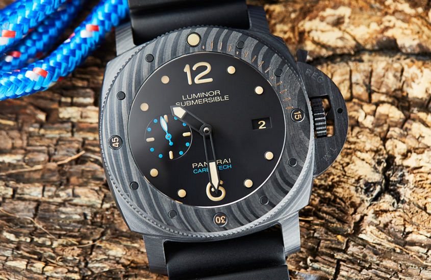 Editor’s note: Few brands have the on-the-wrist presence of a Panerai. Pair that with the futuristic look of Carbotech and you’re onto a winner. Read our review from last year to find out why we love it. At first glance, Panerai’s watches share a reassuring familiarity — large cases, large crown guards and a dial design that puts legibility front and centre. A close look at the catalogue will show that the brand born from its Italian diving heritage has quite a lot of diversity on offer, particularly when it comes to case materials. From bronze to ceramic and (most recently) Bulk Metallic Glass, Panerai has strong form when it comes to material innovation. And today we’re having a closer look at one of the most interesting examples from recent times: Carbotech. Before we talk about the case material, let’s step back for a second and look at the bigger picture. PAM00616 is a 47mm Luminor Submersible, one of the brand’s beefiest cases, good for 300m of depth, and a standout thanks to the solid dive bezel and that patented crown guard. The watch is impressive on the inside, too, with a big P.9000 calibre ticking away, a double-barrelled beauty…
The post What’s featherlight, heavyweight and striped like a tiger? The Panerai Submersible Carbotech appeared first on Time and Tide Watches.
 Seiko’s Baselworld press conference is one of my few must-not-miss appointments, if only for a much-needed dose of humour. But for me, the real star of this year’s affair was Ken Okuyama. Mr Okuyama is an industrial designer with an eponymous studio, who made his name in the world of prestige cars, with a folio including such epic vehicles as the original Honda NSX, the Enzo Ferrari and the Ferrari California. And while much of his career has been spent with some of the great European marques, he’s recently turned his eyes homeward, working on raising the profile and prestige of Japanese and Asian brands. Which is why he’s the creative mind behind the brand new Prospex LX collection. Here are three things that stood out to me about how Mr Okuyama intends to make these watches stand out. “When left alone, heritage becomes antique” Evolution is required to make a modern value for a brand’s heritage. Mr Okuyama reiterated that for luxury brands, design continuity is critical. For all that a Porsche 911 from the ’60s looks the same as one from 2019, they’re completely different objects. The same is true for Seiko’s professional series watches. “Simple, robust and…
 Maybe I’m getting old and grumpy (I am), or maybe it’s a genuine shift driven by the increasing visibility and Instagramability of this hobby/lifestyle choice/money pit we call watch collecting, but I’m noticing an increasing homogeneity in what people are collecting. Steel sports this, royal that, unobtainable the other. Where are the weird, interesting and (most importantly) individual watches? Well, clearly I’m not alone in this, as my Aussie mate Roman has written a piece on just this topic for Scottish Watches (gosh, it’s like a low-key racist joke here — all we need is a bar to walk into). Worth a read, but if you want the TL;DR version – next time you’re heading to a GTG, leave the Sub at home. Read the story here.
 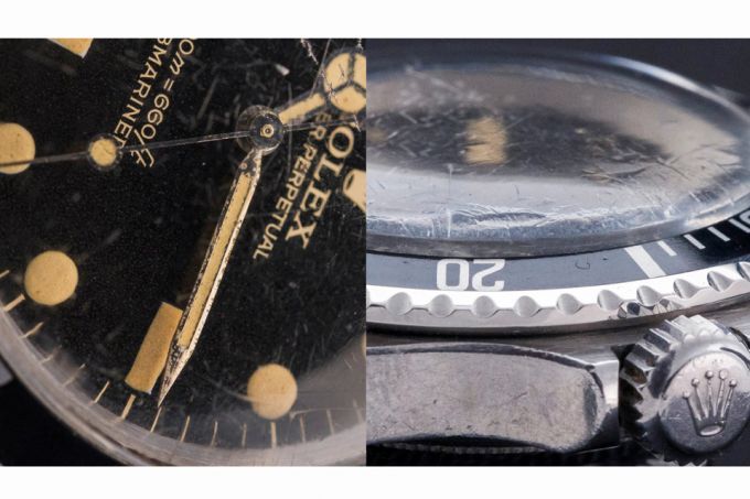 Well, that’s the somewhat provocative title of this piece by Alex Williams, which cites numerous high-profile celebrities wearing high-ticket price vintage pieces as the driver for this ever-rising tide. For people reading T+T regularly, it’s the tale of ever-increasing premiums on seemingly innocuous sports watches. But, to give credence to the bitcoin hook in the title, there’s a healthy dose of qualified scepticism about the skyrocketing investment potential, and the risks that come with the rewards. The most interesting part for me was the coda of models to watch, which included the usual suspects with a few interesting outliers. Are we ready for a Camaro boom? Read the full article here.
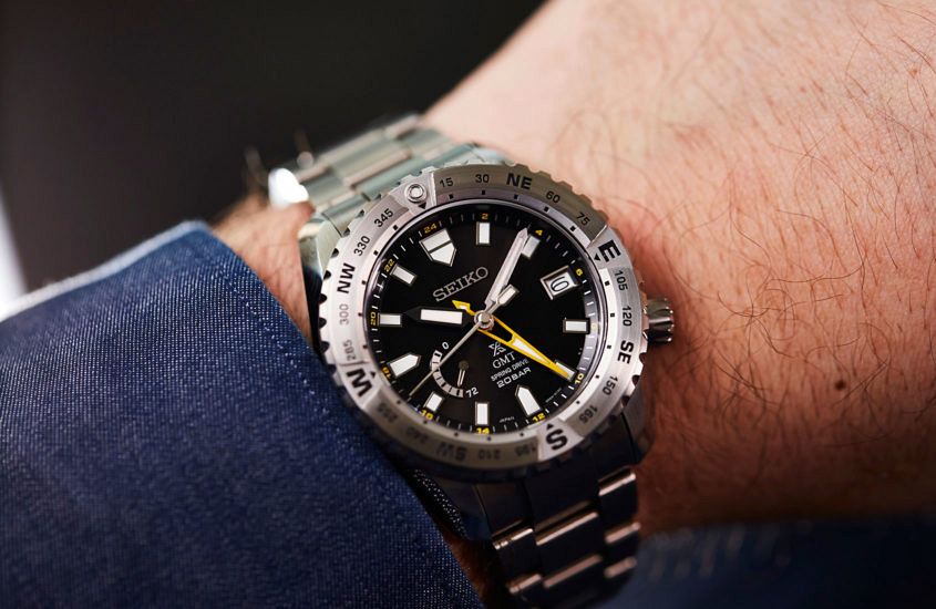
 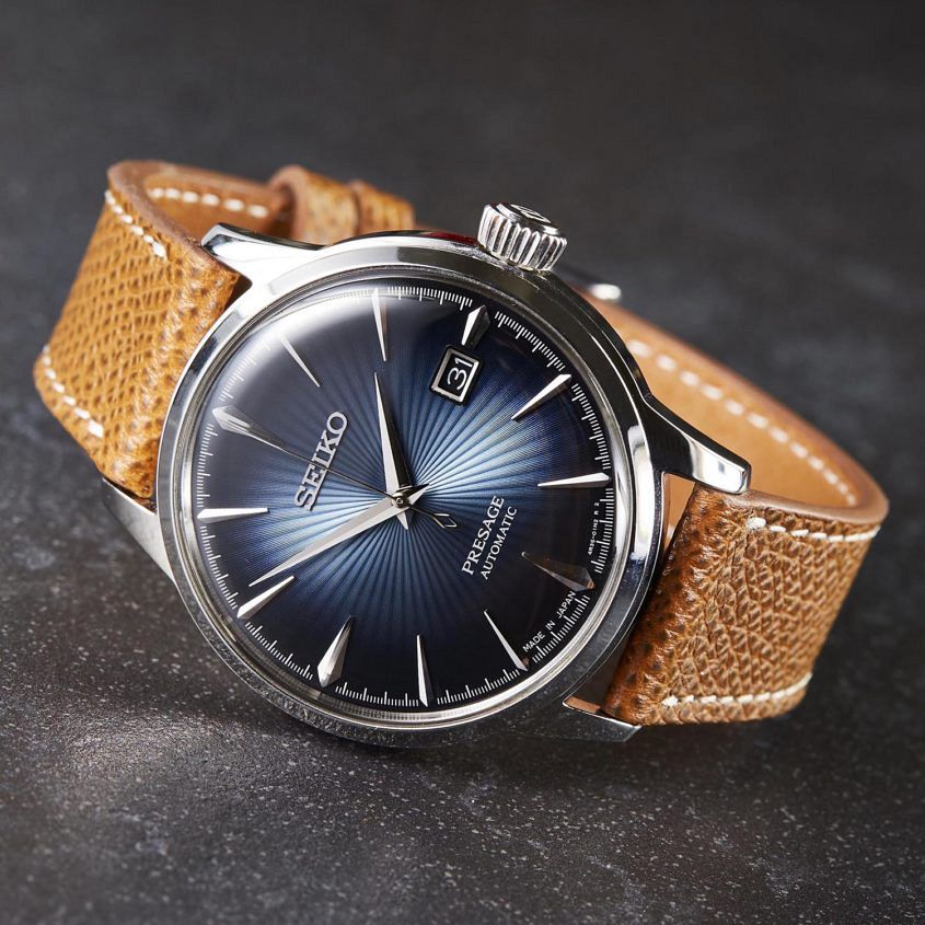 Editor’s note: My first proper manufacture visit wasn’t Switzerland, but Japan. And honestly, the experience has spoiled me. The breadth and scope of Seiko’s watchmaking capacity really is staggering. Read on to find out why … I’ve always liked Seiko. One of the first watches I ever bought was a Black Monster, followed by an ever-rotating roster of rock-solid SKX divers as well as the odd vintage piece, including an original Turtle, a 6139 ‘Pogue’ chronograph (sadly missed) and not one but two 4006-6031 Bell-Matics (neither of which are currently running, but that’s a different story). So when Seiko Australia invited me to tour the company’s Japanese production facilities (wearing an Astron), I jumped at the chance. It’s fair to say I had some pretty solid preconceptions about what I’d experience. I was super-pumped to see the Micro Artists Studio, and Morioka, where Grand Seiko is assembled. Turns out I was not prepared, at all. My ideas about Seiko were not wrong, exactly, but they certainly fell short of capturing the scale of the operation. Day one’s hour-long presentation outlining the corporate structure made that crystal clear. The multiple factory tours and huge rooms full of people and equipped with machinery both modern…
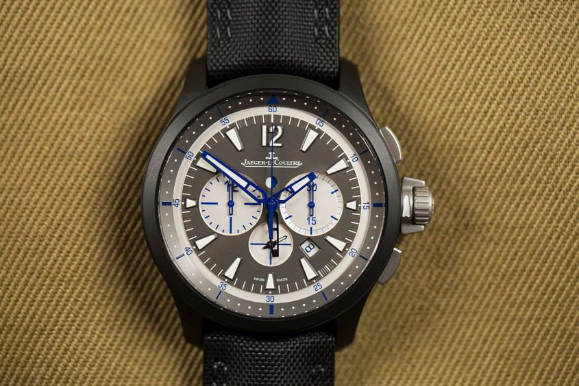 Editor’s note: Whether you’re a wannabe operator or just in love with the stealth appeal of ceramic, this JLC is pretty much the definition of tacticool, even with the blue details. Based on the coverage of Jaeger-LeCoultre’s SIHH releases, it’d be fair to assume the brand put out nothing but dressy Reversos this year. Well, that’s not true. One of the more under-the-radar releases was a handsome update to the Master Compressor Chronograph Ceramic. Physically and functionally, the new version is unchanged from the 2014 original. It’s still the same imposing black ceramic 46mm case, paired with a technical-looking ‘Trieste’ calfskin strap and utilitarian dial layout. What’s new is the colour scheme. Previously, the Master Compressor Chronograph ran with the ever popular black-on-black with red highlights, but JLC has softened this approach, replacing the red flashes with a navy blue, and adding contrast to the dial, thanks to the pale grey chronograph subdials and minutes disc. And while a fresh coat of paint isn’t the biggest innovation in the world, it’s remarkable the difference it can make. The military feel of the watch is greatly toned down, making it feel lighter, and even more summery. More yacht, less attack helicopter. Aside from the new look,…
 Do we ever see adverts calling an Audi A3 a “ladies’ car”, a Porsche 911 or Toyota LandCruiser a “men’s car”? Nope. So, when even the notoriously non-PC motor industry refrains from classifying cars in mutually exclusive gender terms, why does the watch industry persist in doing so? Now, men and women are clearly different. But in terms of style, taste and habits, the traits of masculinity and femininity exist on a spectrum; there’s no fixed divide. So, in an age when nobody bats an eyelid at men wearing pink or women wearing trousers – well, apart from a handful of airline CEOs who still insist that the “hostesses” wear skirts – the rigid classification of watches as men’s and women’s (or the old-fashioned and rather patronising “ladies”) is an anachronism. Of course, at the poles of this spectrum, there are watches that exude traditional, typecast masculinity (huge, aggressively butch tool watches) and femininity (delicate, gem-set dress watches), and there’s no reason for the best examples of each genre to compromise. However, in the vast middle between these extremes, there’s no need for gender labels. Why shouldn’t a man wear a modestly sized or gem-set watch? (Let’s remember that until…
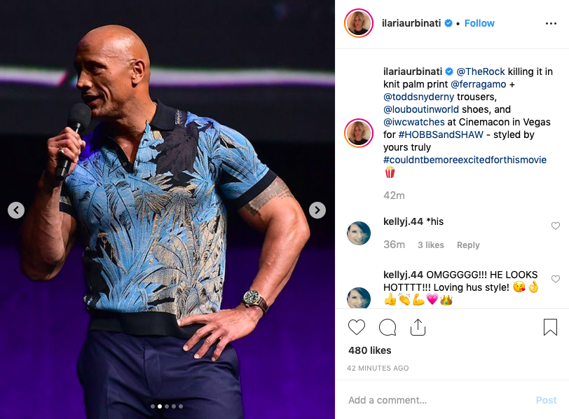 Yesterday, Dwayne Johnson touched down in Las Vegas to showcase his new buddy action flick Hobbs & Shaw at CinemaCon, an industry event. But while I’m sure there were explosions aplenty, what really grabbed our attention was something else entirely. What The Rock was wearing. That Ferragamo knit with a palm print is in-credible. Also, the dude is wearing the brand new IWC Big Pilot’s Watch Perpetual Calendar Spitfire — which is, let’s be clear, a 46.2mm watch that certainly earns the ‘Big’ moniker — like it’s a dainty 36mm. Nuts. This particular Big Pilot was released at SIHH earlier this year, and is one of the crown (complicated) jewels in the revamped Spitfire collection — with a bronze case, green dial and a lot of complication. It’s limited to 250 pieces and has an indicative Australian RRP of $42,600
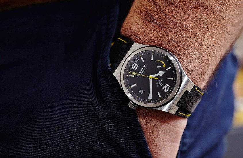 Editor’s note: When it was first released, waaaaay back in 2015, the North Flag was a big deal. So much so that the main question in our review was whether or not Tudor was planning to move beyond their heritage core. Well, history has answered that question (heritage is here to stay), but that doesn’t mean that the North Flag, with its genuinely interesting design, isn’t a worthy watch … The story in a second In the days before Baselworld 2015 the speculation surrounding the next big Tudor release was high. Even so, no one saw the North Flag coming. The big question Can Tudor move beyond the Heritage collection? Ever since Tudor’s spectacular rebirth a few years ago they have been looking to the past. Their greatest hit – the almighty Black Bay — is a watch that epitomises the heritage trend that has swept across Switzerland and the rest of the world. But the heritage trend can’t last forever, so Tudor is looking to the future. And the watch at the vanguard of this next generation is the North Flag. It’s a completely new design, with a precise, technical and almost aggressive case design that looks nothing like…
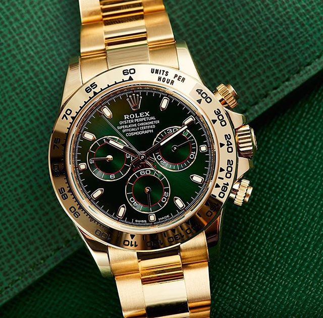 Editor’s note: One of the biggest takeaways from John Mayer’s Daytona-fest that was his Talking Watches Part 2 was the fact that the dude managed to blow up 2016’s yellow gold and green-dialled Daytona overnight. If you can get it now, get it. Here’s our original review (and Jason’s stunning pics) of this yellow gold stunner … Though the devastatingly cool new steel Daytona is the Rolex chronograph de jour, this year the brand also released new variations of their classic chrono in white and yellow gold. Today, we’re having a look at the reference 116508, in 18 carat yellow gold with a new green dial – a colour combination that no Aussie can resist. The reference 116508 is the same 40mm Oyster case, powered by the calibre 4130, accurate to within -2/+2 a day. Indeed, the only difference between this reference and earlier models is the dial. But what a dial. Yellow gold versions of the Rolex Daytona are most commonly seen with black or champagne dials – the green is stunning in its sheen and richness. Of course, green is a special colour for Rolex, but in this instance it’s a green not like the bright tones of the green Submariner…