HANDS-ON: The Breguet Classique 7147 gets an enamel update
 Last year’s slim Breguet Classique 7147 had a spectacular dial, with a central section in detailed engine-turned guilloche and a subdial in a delicate crosshatch pattern. It was, not to overstate things, the star of the show. It’s a very difficult art to master, but there’s no doubt that Breguet has the technique down pat. So, imagine our surprise when we were presented this year’s update of the 7147 and there was not a hobnail or brushed finish to be seen. In its place is a single piece of lustrous grand feu enamel – an equally tricky technique to master – and this single change creates a completely new look for this dressy design. Thanks to the multiple firings the white enamel is of a brightness and lightness, and has an undulating sensuality, that’s hard to capture in photos (and even harder in words). It also has delicately hand-painted Breguet numerals (of course) and a delightful minute track (the non-cardinal markers are stylised fleur de lys) . The best bit though is the delicate dip that constitutes the small seconds subdial. The hands are pure Breguet, and made of hand-blued steel. Looking beyond the dial, everything is as it was with guilloche…
The post HANDS-ON: The Breguet Classique 7147 gets an enamel update appeared first on Time and Tide Watches.
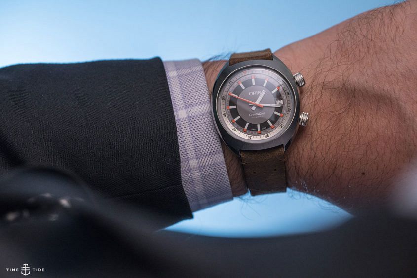 One watch leapt out at me from Oris’ 2017 collection – the Chronoris Date. Not only is the colour scheme and tonneau case shape pretty eye-catching, but it’s also an honest and authentic homage to the timepieces of the ‘70s. In fact the Chronoris name refers to a 1970 design that was the brand’s first chronograph. This reinterpretation isn’t a chrono, but it’s certainly an era appropriate design. Given that I’ve got an incredibly soft spot for this sort of fun and funky design (I’ve been wanting an Omega Memomatic for ages, and – until it died – a compressor cased Bulova Accutron was one of my all time faves) my attraction to the Chronoris is perhaps unsurprising. Personal bias aside, the Chronoris Date is a winner of a watch, with a solid 39mm cushion shaped case with a pleasing radial brushed finish, paired with a domed sapphire crystal, 100m of water resistance and, as we’ve come to expect from Oris, it comes on a range of solid strap options. However, my favourite part of this watch is the dial. Seriously, look at it. The colour scheme of white, grey and black, with orange accents is just hot. I particularly…
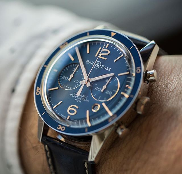 Editor’s Note: Bell & Ross released a toned down vintage model this year, the first in their ‘3rd Generation’ vintage armada, with a flatter case and a smaller diameter. It’s a strong piece, with notable improvements to quality like screw-down chronograph pushers, but it’s in a monochromatic rather than colourful mood. Which made us think of last year’s blue-tiful BR126 Aeronavale. Judging by the reaction on social media and the site, it was a watch that changed hearts and minds about B&R’s ability to do interesting things in the vintage field, with a fanatical attention to detail (those brushed applied indices, sigh…) and, honestly, it looks even better a year on. Bell & Ross has never been afraid of colour. And their bold, highly graphical square instrument watches are a natural canvas for creative experimentation. The brand’s more traditional round watches are a little bit of a different story – inherently more conservative; B&R tend to play things safer with their Vintage collection. Which is why the Aeronavale range is such a big old bolt from the blue – and boy, did the risk pay off. While the form of the Vintage BR 126 Aeronavale (and indeed the simpler BR 123) is the same as…
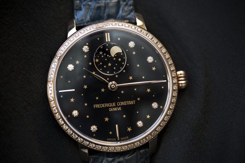 Even here in Australia – relatively under-populated and enormous as it is – you need to venture out to the country to get a proper look at the stars. There’s really no ignoring the stubborn corporate buildings and incessant traffic that means our cities and towns are constantly bathed in urban glow. So how do we get our fix of the pure unadulterated night sky? Easy: regular camping trips out in the bush. And for those times of year when that’s not possible? Well, how about a spot of star gazing via the Frederique Constant Slimline Moonphase Stars Manufacture, which has just been unveiled at Baselworld. We got a sneak peek ahead of the fair, and it really is lovely. The key feature is clearly the moon phase, which rotates elegantly just beneath the 12 o’clock position, appearing to scatter stars across the midnight dial as it does so. At 38.8mm, it’s fairly large for a women’s timepiece, and with sixty diamonds sparkling around the bezel, it runs the risk – on paper at least – of being overwhelming. In actual fact, it’s nothing of the sort, and on the wrist, it looks daintier than its size would suggest. There’s…
 When Gaëtan Gaye moved from Richemont’s Amsterdam office to Ressence in 2015, he doubled the size of the Antwerp-based team, which was quite the change in scale. What hasn’t changed, is his twin passions for watches and cars, as evidenced by his Instagram feed. NAME: Gaëtan Gaye OCCUPATION: International Brand Director for Ressence HANDLE: @alpagota FOLLOWERS: 3.4k LOCATION: Antwerp, Belgium Tell us about joining Ressense. Well, I was asked by Benoît Mintiens, the founder of Ressence, to help him develop as a brand and as a business. Coming from Richemont to a start-up was a real challenge, professionally and personally, but it has been an amazing adventure. From our collaboration with Mr Porter to our presence at SIHH, we’re growing step by step. What are you working on at the moment? Growing Ressence in a stable and healthy way is keeping me busy, as we are working on so many projects at the same time. Benoît and I are brainstorming a lot as we want to create our own path in terms of products of course but also on every other aspects of the business. We believe in integrity and creativity. I can’t tell you more unfortunately but you’ll hear from us…