This is what $2,000,000 of diamond watch looks like – meet the Franck Muller Invisible Setting with rubies
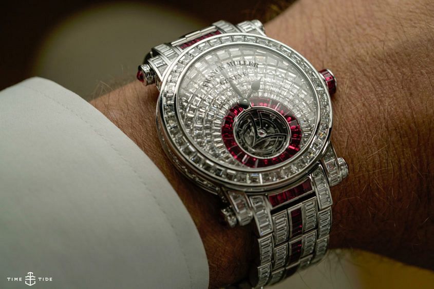 This is not an under-the-radar watch. So if you’re looking for an unassuming dress watch, scroll on. But if you like your timekeeping served with a bit (OK, a lot) of bling, this might be up your alley. But be warned: the price — much like the weight in stones — is hefty. Want to see what it looks like on the wrist? Make sure you check out Andrew’s video with it here. So, what are we talking here? Well, there’s a tourbillon. Normally that little cage — here shaped like the Franck Muller logo — would be the star of the show, but on this piece, it plays second fiddle. First violin is definitely occupied by the stones — there are rubies, 21 on the dial (2.42 carats), surrounding the tourbillon cage. There’s another 70-odd rubies on the bracelet. And then there are diamonds. Lots of diamonds. We’re talking about 474 stones in total, all ranging from D to F, and VVS in clarity. There are 122 stones on the dial, 40 on the bezel, 44 on the case and 268 on the bracelet. The baguette-cut stones on the dial are particularly impressive, invisibly set and arranged radially. Very, very nice indeed.…
The post This is what $2,000,000 of diamond watch looks like – meet the Franck Muller Invisible Setting with rubies appeared first on Time and Tide Watches.
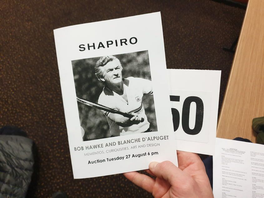 Bob Hawke’s estate auction offered a chance to reflect on a man known equally well for his capacity to skol a pint of beer in record time (he broke a beer drinking Guinness World Record in 1954) and being a past Prime Minister of Australia. The auction took place in a venue that could only be described as aptly representative of our country’s cross-sectional majority – an RSL in inner Sydney. It was an appropriate venue to celebrate the collected objects of one of Australia’s most fondly remembered leaders, as it grounded you in a sense of not taking it all too seriously, a reminder offered by the noise and flashing lights of the pokies room. Upon arrival there was an immediate sense of the man we were all here for. A crowd of close to 300 Sydney-siders filled the space, leaving standing room only. But there was no joy or excitement in the air. Instead, it was a state of respectful sobriety (yes, strange for an RSL), with people silently flicking through their catalogue or murmuring to their neighbour. There was a recognition that we were not gathered for an auction, but a memorial which offered insights into a…
 We’ve been having a bit of a lunar week with Longines this week — checking out their new Master Moonphase in the boutique and in our studio. And we thought we’d stick with the theme this Friday. Today we’re taking a closer look at the stylish, chic and generally handsome Longines 1832 Moonphase. If the Master Moonphase is a contemporary piece with heritage notes, the 1832 is the other way around: strong, full-bodied heritage overtones with solid underpinnings of modern construction. To me, the whole package exudes old-world charm, but it’s the dial that sings strongest. The dial is beige, with a finely grained finish, that looks incredible up close. On this matt surface there’s a whole lot of charming applied features — the winged hourglass logo, with finely printed text on either side, the faceted, polished, chocolate-block-like hour markers and even the minute dots. All these elements play together to add to the overall air of sophistication and polish, The polished arrow-shaped hands, with small lines of Super-LumiNova, work well in this context. And the well-proportioned moon and date display, nestled in the lower half of the dial, adds in some colour and breaks up the expanse. There’s a reason…
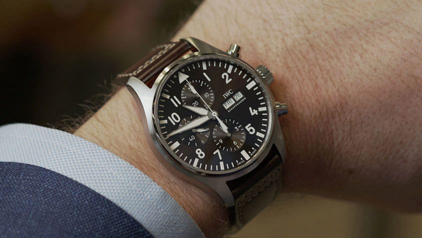 Ladies and gentlemen, we’ve begun our descent. Now that we’ve completed our overview of the Top Gun, Spitfire and Classic collections we’d ask you to stow your tray tables and please pay attention to the final instalment in our series – the IWC Pilot’s St Exupéry collection. Now, IWC’s St Exupéry watches are named for the famed author of Le Petit Prince, who was also, it turns out, a pioneering aviator, and he was lost during a reconnaissance flight over the Mediterranean in 1944. IWC’s watches honouring the man and his works take two main forms — the Le Petit Prince and the Antoine de Saint-Exupéry. Andrew looks at one of each. IWC Pilot’s Watch Chronograph Edition “Antoine de Saint-Exupéry” The classic chronograph takes a decadent twist thanks to the glossy brown dial that’s a hallmark of the Antoine de Saint-Exupéry line. Rich, warm and irresistible. IWC Big Pilot’s Watch Edition “Le Petit Prince” IWC’s big boy gets a blue facelift with a beautiful blue starburst treatment, which elevates the utilitarian dial design into far dressier territory. Made in partnership with IWC. However, the opinions expressed in this article are our own in accordance with our Editorial Policy.
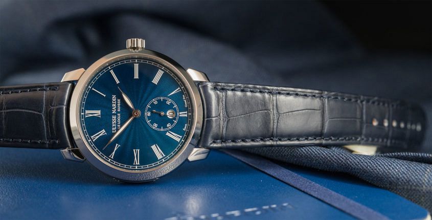 Editor’s note: This watch might not be the newest release but, by gosh, it’s as fresh today as the day it passed final quality control. We take another look at the Ulysse Nardin Classico Manufacture Grand Feu … Ulysse Nardin pulled out all the stops for its first SIHH showing. In a fair characterised by conservative product releases, the Le Locle-based manufacturer presented a strong line-up of novelties, with a strong nautical theme. Highlights included the new regatta timer, the technically impressive Marine Grand Deck, as well as this watch – the Classico Manufacture Grand Feu. This very traditional timepiece is jam-packed with smart details and offered at a highly competitive price. At 40mm across, the round steel case is hard to dislike, with its wide polished bezel, slightly clawed lugs set into the case middle, and a crown that’s simple, sturdy and not at all fiddly. Nice though the case is, it doesn’t hold a candle to what’s within. The movement is the UN-320 caliber, made entirely in-house, down to the silicium hairspring and escapement – a feat of which the brand is rightly proud (the oft-repeated message at SIHH was that none of the other exhibiting brands made their own silicon hairsprings).…
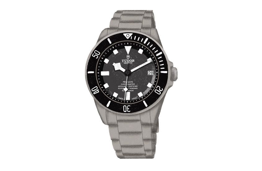 Editor’s note: A little while ago we went off-script with our watch coverage, making a short, snappy series of videos that — in a decidedly tongue-in-cheek manner — aimed to assist you in your Tudor purchasing decision. Here’s our take on the archetypal Tudor Pelagos wearer. And if you’ve got a Pelagos on your wrist and you’re not wearing a single item of Patagonia, isn’t it time you questioned your life choices? “Which watch should I get?” It’s the first, and hardest, question to answer for any watch lover (shortly followed by “which watch should I get next?”), and our news and reviews aim to make that question easier for you to answer. Well, today we make it simpler yet, with a series of three short videos that each ask, “How do you know which Tudor is right for you?” We match three key watches from Tudor’s catalogue to three styles of wearer, albeit in a slightly tongue-in-cheek way. First up is Tudor’s mighty technical diver, the Pelagos. So, if the above video resonates with you, you might want to check out our longer review. But you’re not completely off the hook — the next tricky question is: Black, Blue…
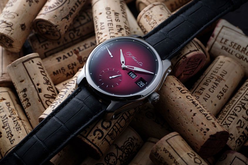 If you’ll pardon the pun, Moser pioneered the development of elegant, perpetual calendars with their subtle Endeavour, which saw the month displayed using a short hand, mounted on the central pinion, and using the 12-hour markers as surrogates for the months of the year. Well, this model, the Pioneer Dual Window Perpetual Calendar, sees the brand change gears a little, steering the complication into more legible territory. Gone is the central hand, with the month indicator now occupying a prominent aperture next to the extant date window at three. The increased legibility certainly adds some visual weight to the right-hand side of the dial, which is partially offset by the power reserve at nine (bonus points for using the same typeface as the date/month wheels on the reserve indicator). The vertical axis design features are the printed brand up top, and the hefty sub-seconds down the bottom — with nice circular graining details. And because this is a Pioneer, you get a steel case, and luminous pops on the dial and those semi-open hands. The case is big at 42.8mm across, excluding the grippy conical crown. There are two dials on offer — a very interesting burgundy fumé that has decidedly aubergine…
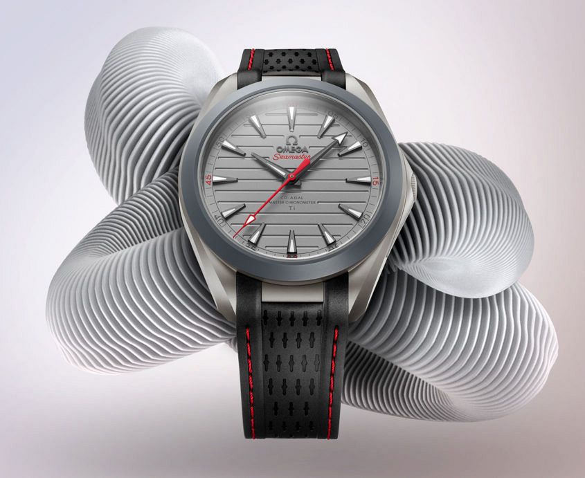 The headlines this week have been full of Omega’s latest Aqua Terra, the very matt, very lightweight Omega Aqua Terra Ultra Light. The major selling point has been its light weight of 55 grams, a new alloy and its fancy new disappearing crown trick. It’s made with golf in mind, but the potential is more than that. I was pretty excited by this release, until I caught wind of the price, which is just under $50K USD. Now, sometime T+T writer Justin has written a punchy analysis of this piece (and whether it lives up to the hype and the sticker price) over at Watchuseek — well worth a read. When all is said and done, though, I can’t wait to try it on. Read the full story here.
 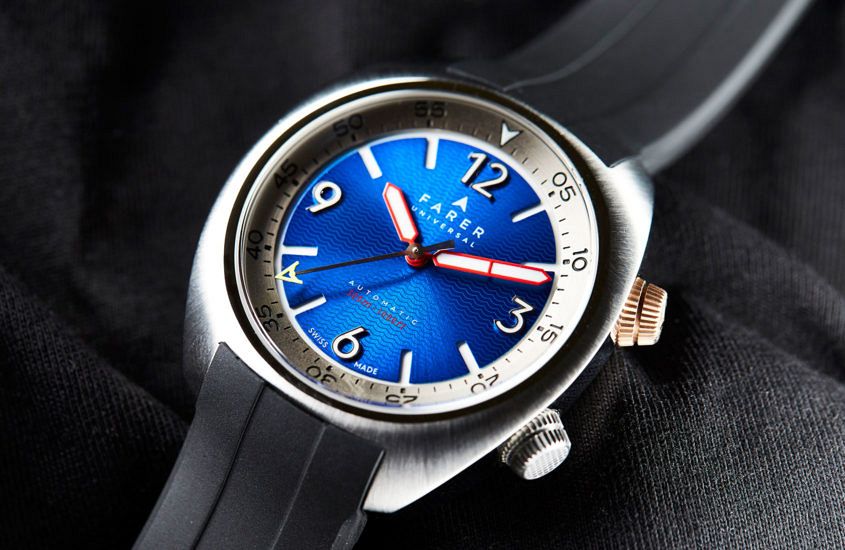 Editor’s note: Not everything in the watch world has to be same-samey. And the Farer Aqua Compressor Hecla is a great example of that. It’s got two crowns, a big, cushiony case and style for days. If left-of-centre is your thing, you’ll want to have a read of Andy’s review … A parcel recently landed on my desk. It had made the journey all the way from the United Kingdom, and it contained two pieces from British microbrand Farer Universal. Launched earlier this year, these models made waves with their colourful dials and brightly accentuated designs. So when the opportunity arose to test drive a piece, just in time for the Australian summer, I dived right in and put the Farer Universal Aqua Compressor Hecla through its paces. The first thing I noticed was — of course — the striking blue floating dial, with a wave-cut pattern, which changed gradients with the shadows. It was the perfect base for the raised polished numerals, which added some nice sophistication to the dial. In terms of legibility, we have the extra-large handset, with white Super-LumiNova — a great colour choice given the rich blue dial. A final touch: a warm and bright…
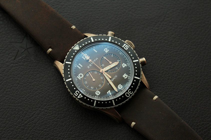 Editor’s note: It’s 2019 and bronze is here to stay. And I’ve got to say that, as far as trends go, this is one I can very much get behind. And while the combination of bronze case, heritage style and gradient dial is more common today than in the past, the Zenith CP-2 Bronze Flyback Chronograph is a fabulous looking example. Here’s Justin’s review from when it was released, back in 2018 … There’s no denying how many of us are often frustrated by the frequent “mild updates” launched by brands — new dial colours, new case and bezel materials, and the like; however, this year in Geneva, Zenith were one of the few to do so with such thoughtful execution that we couldn’t not make it a point of discussion. Yes, we’re talking about the beloved Cairelli chronograph reissue, the Pilot Cronometro Tipo CP-2 Flyback, unveiled in bronze (as well as aged steel) for 2018. Bronze continues to gain huge traction in the “accessible luxury” segment, and having first capitalised on the trend in 2015 with the bronze Pilot Type 20, creating a bronze CP-2 was a logical choice. Surprisingly, one of the key selling points of the new…