5 things you need to know about Bremont that explain why they have come so far so fast
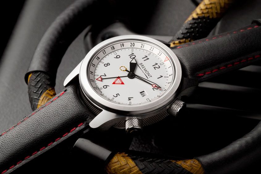 I distinctly remember the first time my interest was piqued in Bremont. Until then, I’d seen the brand around, but not been attracted to what appeared to be pretty plum conservative designs. I’d noticed the watch in Kingsman: The Secret Service and thought it was a clever, jolly appropriate spot for such a British brand, but again I hadn’t particularly warmed to the look of it – and without the ability to blow up enemies with it in real life, had no pressing urge to learn more. But then, in a meeting with an Australian distributor, a conversation took a twist. He had a swollen black eye. “What happened to your face, Leon, are you ok?” I asked. Leon launched into a story about standing on a stool to do something in his back room. About falling and landing on a tiled floor. “But the real miracle,” he said, “is that I actually landed on my wrist first and this is all that happened to my watch!” He proffered his wrist. On it was a Martin-Baker III on bracelet, and I inspected it closely – some marks on the bezel, a mini-bear claw swipe of scratches on the bracelet, but very…
The post 5 things you need to know about Bremont that explain why they have come so far so fast appeared first on Time and Tide Watches.
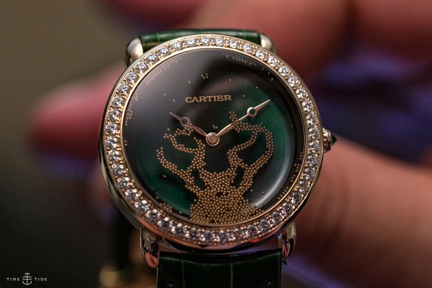 Editor’s note: This year at SIHH we were treated to another look at the stunning Cartier Révélation d’une Panthère, and the 2019 version was helpfully explained to us thus: “Last year it had 900 gold beads forming the face. This year it is 650 diamonds. We had to redevelop and re-engineer everything. Diamonds and gold are not the same materials: one is heavier and the diamond is a bit thicker, which meant changing the size of the cavities in the panther head. It was a good challenge for us. The diamonds are brilliant shaped and they can move in three dimensions. We engraved cavities and developed a fluid that ensures the diamonds move slowly. The diamonds are effectively floating in the fluid and then they fall slowly into the cavities. The entire watch is filled with fluid. One of the challenges was that this fluid must also be invisible. It must be completely transparent. It took five years of development.” Impressive stuff. For more, here’s Sandra’s take on the 2018 version … Over the past decade, while earning its chops as a serious technical watchmaker, Cartier has demonstrated time and again its mastery of the artistic crafts – métiers d’art…
 These days, “NATO strap” is a catch-all term for any sort of nylon or fabric watch strap. In reality, it’s a little more complex. The use of the term NATO is something of a misappropriation that arose because the ‘original’ fabric strap (20mm, nylon, chrome-plated hardware, in admiralty grey) could be requested using a form relating to its NATO stock number. Hence, the catch-all NATO term was born. Ken Kessler goes into great detail on all this backstory, as well as the more recent chapters in the NATO strap narrative, in this Revolution piece. And as a NATO strap (of many stripes) is my default strap (heck, we even sell them), I found it a fascinating read, and hopefully you will too. Read the whole story over at Revolution.
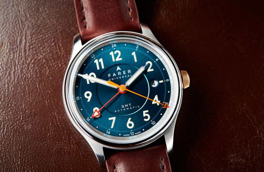 Editor’s note: Who doesn’t love a good micro brand (we certainly do)? In many ways the little guys have so much more freedom than the big brands, when it comes to design, production (and all the rest). Case in point is the Farer Lander GMT, which we reviewed last year … Having previously reviewed the Farer Aqua Compressor Hecla, I thought it was time to explore some more of the British microbrand’s offerings. Enter the Farer Lander GMT Automatic, one of three pieces within Farer’s GMT Automatic range. As I unboxed the Lander, the first thing that grabbed my attention was the dial. Farer describes the colour as ‘sea green’, which, when you think about it, is quite an accurate description. Bursting with colour, the dial has a sunburst-style finishing, meaning the moment you walk outside into the sunlight it takes on a new appearance. This was my favourite feature of the watch and looked great when contrasted with the dark brown strap. There’s a lot of other detail in the dial, which Farer refer to as a ‘triple step dial’. The bold font of the hour numerals features a Super-LumiNova outline, which adds an additional layer of depth and…
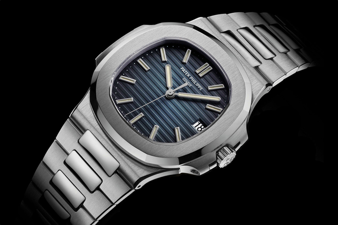 I no longer have any desire to own or wear a Patek Philippe Nautilus 5711. Not because I like the watch any less than I ever did (it’s a great design, produced by one of the best makers in the business) but because I don’t want to be associated with what it has come to represent. Not “represent” in the sense of its significance (along that of Royal Oak) in the history of modern watchmaking but because it’s the apotheosis of the money-chasing mania (and its flip-side, the status-symbol-chasing mania) that has gripped certain parts of the watch world in the past couple of years. A mania that is ruining things for genuine watch enthusiasts and collectors. I’m talking here about current catalogue models – coming to the secondary market brand new or “very recently” pre-owned, aka flipped. (The vintage market has its own, different story of price/value escalation). It’s a peculiar kind of madness that has brought us to a point where steel sports watches are being listed at 200 per cent of their retail price; steel watches designed as everyday wearers fetching more than their precious metal counterparts. A circa-10-grand GMT Pepsi or Batman – or maybe a…
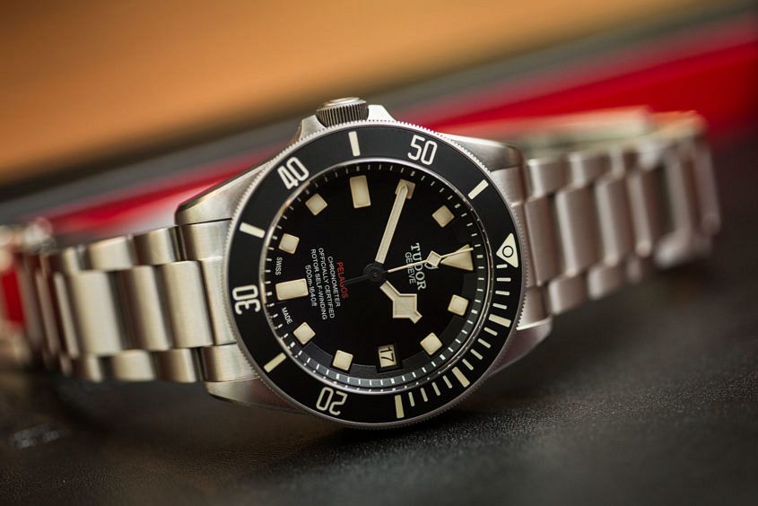 Editor’s note: The last time the Tudor Pelagos received a significant line extension was the LHD (left hand drive), which debuted in 2016. It’s a great watch — and arguably the ‘hottest’ of the Pelagos variants. But something we can all agree on is that it’s a line that’s well due for some more attention. Tudor, don’t let us down at Baselworld 2020 … Once again, Tudor has surprised and tempted us with a brand new release just before Christmas – the Tudor Pelagos LHD. On the whole it’s the same Pelagos we know and love, with just a few tweaks – but these small changes combine to show the watch in a completely new light. First of all, the case. It’s the same 42mm titanium case we’re used to, with one not-so-minor difference – the crown is on the left, a feature that gives the watch its left-hand drive sobriquet. The inspiration for this unusual configuration comes from the brand’s past. In the 1970s, the Tudor Submariner was the watch of choice for French Naval divers. Some of these were delivered in a left-handed format – perhaps for divers who wore the watch on their right hand, or perhaps simply so the prominent crown…
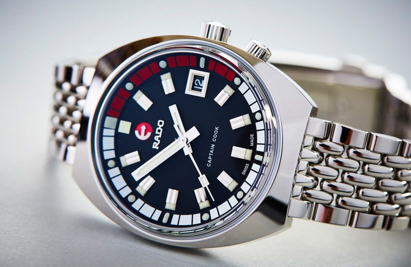 Editor’s note: Size is one of the prevailing issues in watchland. Too big? Too small? It’s one of those ongoing debates that rages on (and on and on and on). A watch that clocks in at 37mm would typically be seen on the smaller size of this spectrum — so much so that many would discount it on dimensions alone. The Rado Heritage Captain Cook Tradition Mark II proves that you’d be a fool to judge a watch too small on specs alone … Last year, Rado had a breakthrough, heritage-inspired hit with their Captain Cook, a slightly quirky 37mm diver. This year they’ve doubled down on the Captain, with the Mark II, a curvy, funky ’60s-inspired diver. The heritage look is really strong, from the super-polished cushion case, through to the super high crystal and the era-appropriate dial details, like the broad hour markers and internal bezel. Though I think what I like most about this Rado is, funnily enough, the bracelet. So often the bracelet is an afterthought, tacked on at the end. But Rado have clearly thought this one through. It’s a solid-feeling ‘beads-of-rice’ style bracelet, on a single fold clasp with a lovely vintage look. It…
 Seiko’s distinctive shrouded diver (commonly called the ‘Tuna Can’) is a real cult model, due in equal parts to its indestructibility and its distinctive design. It’s a watch that stands out from across the street, or in five metres of murky water — depending on how you like to use your dive watches. Having said that, this solar-powered iteration — one part of a trio — is aimed more at a topside clientele, as the ‘Street Series’ sobriquet suggests. The series is offered in three colours — navy blue (which we’ve got here), an olive-y green and grey. The colour is due to the silicon strap, the shroud, the bezel and the dial. And for all that this is a lot of colour, the lack of contrast or superlative (dare I say flashy) design elements give the Street Series watches a serious, purposeful sensibility. They will also go quite well with a variety of outfits, which is a boon. But don’t be mistaken for thinking that these watches are style over substance. They’re still every millimetre the legendary Seiko diver — all 47 of them. They’re rated to 200 metres, and generally considered to be bombproof (don’t test the theory). Adding…
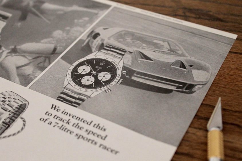 Editor’s note: One of the more interesting Instagram accounts I’ve followed in recent times is @adpatina, dedicated to sourcing (and selling) vintage watch ads. Clearly, I am not alone, as Ad Patina has graduated from Instagram and is now a fully fledged site and store. So, if you ever wanted to know what makes a good watch ad, or just want one to hang on the wall, read on … So, how did you get into vintage watch ads? Ah, it all started when I was a teenager in the mid ’90s … I remember taping Rolex ads to my bedroom wall. The ads weren’t vintage, and, oddly, most of the models advertised weren’t ones I wanted to own. They were just random Rolex ads (I even had Lady Datejust ads pinned up). It was less about the actual watch, more about the brand. You see, I aspired to own a Rolex, and having these ads greet me as I entered my room — looming over my head as I did homework, the last thing I saw before falling asleep — served as a reminder and motivation to get good grades, work hard, stay out of trouble, so one day I’d be in a position to get one.…
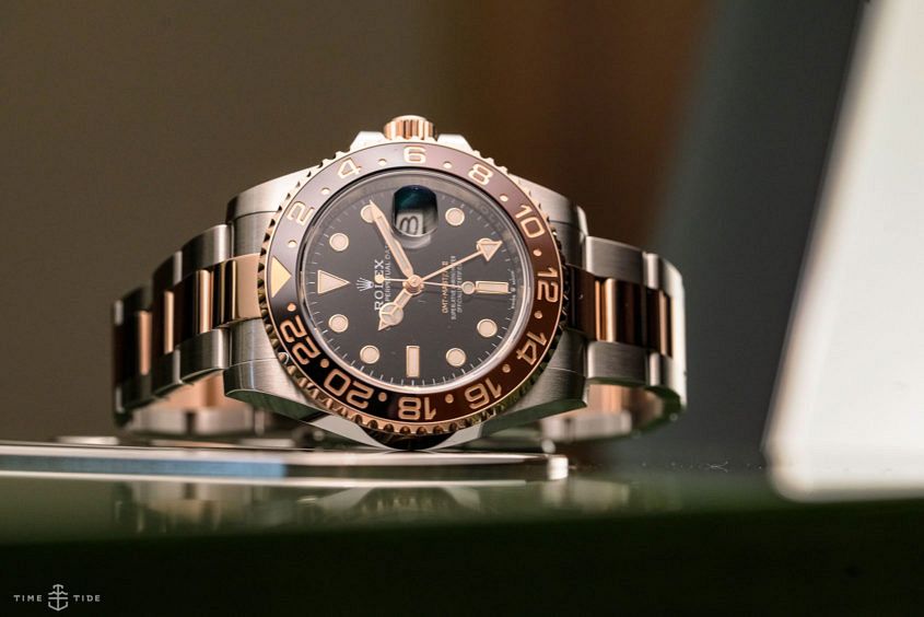 Editor’s note: Root beer is a peculiarly American drink, sweet and vaguely medicinal – not at all unappealing but an acquired taste. Can the same be said for the Rolex GMT-Master II in Oystersteel and Everose? Perhaps, but it’s a particular flavour of Rolex that Andrew fell hard for at Basel 2018, and 12 months on, the love is still going strong … In the wee hours of this morning, as I was recording this voice-over, it occurred to me that the only watch from the new Rolex GMT-Master II collection currently not receiving a massive amount of coverage at Basel 2018 was the one in the middle – with both Oystersteel and Everose elements, the two-tone, or as Rolex call it, Rolesor model. It just so happens that, at this point in time, it’s the one I’m most fixated on. I think, without stealing too much of my own thunder, it’s the way that all the colours, finishings, materials, and fine details come together – and play off one another. I’m sure that once the Pepsi sugar high has worn off a little, the glittering Rolex GMT-Master II in Oystersteel and Everose will have its time in the sun, but…