INSIGHT: The craft of Van Cleef & Arpels
 Van Cleef & Arpels have long been recognised as one of the world’s most creative high jewellery houses. Taking inspiration from nature, magic and fairy tales, the Parisian Maison creates complex jewels of unusually high technical and design content – so that even the most extravagant pieces have a lightness, charm and wit. In recent years, Van Cleef & Arpels have also become recognised for their artistic and highly creative watches. But it is no mere arriviste in the world of horology. In the 1920s the famously elegant Louis Arpels designed the Ruban (‘ribbon’) watch, with a rectangular case that formed an unbroken line with the links of its gold bracelet. A 1927 pocket watch with a double retrograde display featured a robed Chinese Mandarin on the dial, whose arms indicate the hours on one side and the minutes on the other. Having coined the phrase “Jewels that tell the Time”, Van Cleef & Arpels have always endeavoured to blur the lines between high jewellery and horology. However, a decision made in 2006 has radically changed the Maison’s stature in watchmaking. Stanislas de Quercize, then the CEO, asked Nicolas Bos (Creative Director at the time, Bos succeeded de Quercize as…
The post INSIGHT: The craft of Van Cleef & Arpels appeared first on Time and Tide Watches.
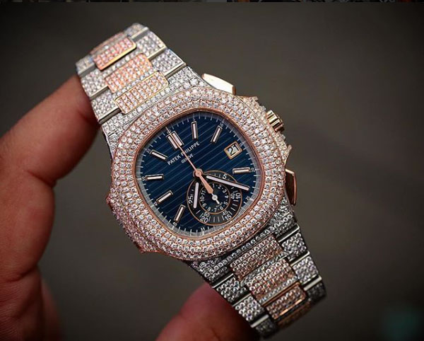 Once known as ‘Mr Flawless’, Greg Yuna is an entrepreneur and custom jeweller to celebrities like Drake, Floyd Mayweather Jr and Meek Mill. We talk custom watches with Greg, to gain some insight into one of the more controversial parts of the watch industry. How did you get your start customising watches? I started with working for my uncle about eight years ago. From there, I started creating and icing out these watches. Here in NYC, it’s very popular, because of the culture. What’s going on right now is a race to see who can take the biggest, baddest watch and ruin it. Who has the balls to ruin them first, and that’s where I come in. What I try and do is get the most popular, hottest watches, as soon as they come out – and ice them out, to have them on the market before anyone else. I recently opened my store in July; before that I was known as ‘Mr Flawless’. Back then, I was working with my uncle, and eventually we parted ways. Do you have a favourite brand or particular watch to customise? I love working on Audemars Piguet and Rolex, those are my two…
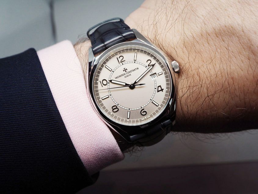 Making luxury watches more approachable without compromising quality is a delicate art, and one that Vacheron Constantin have been quite successful at in recent years. With the unveiling of their all-new FiftySix collection, they have reaffirmed their commitment to delivering some serious, value-packed offerings. All told, the collection is comprised of six models, three in stainless steel and three in pink gold, and at the entry point of the collection we’re seeing a new and lower starting price for the brand with the steel FiftySix self-winding. This is the first time in a number of years that we’ve seen a completely new collection from Vacheron, and even though it’s coming in at the lower end of their range, it is anything but “entry level”. The dial’s opaline centre and a sunburst brushed outer ring creates a subtle contrast that varies significantly depending on lighting conditions — the two being separated by a slim white minute track. A mix of applied baton and Arabic numeral indices are used, with a healthy application of SuperLuminova applied to the batons, as well as its hour and minute hands. Date placement is often a contentious issue when brands start playing in more affordable price…
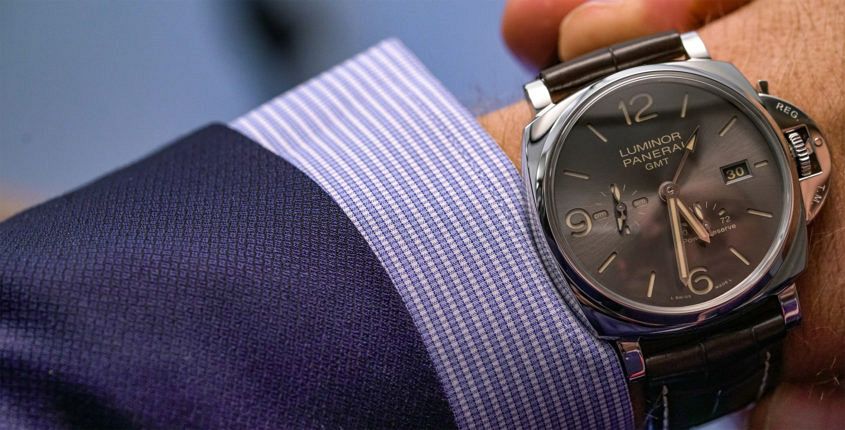 When it came to Panerai’s latest collection, we’ve already covered off how the Luminor Due was the surprise star. And while it’s fair to say the smaller models accounted for a disproportionate amount of the noise, there was strong representation at the larger end of the scales. In particular this watch, PAM 00944, a full-cream 45mm case, which — thanks to its Due status — still slips under the cuff with far more ease than its ‘regular’ Luminor brethren. And, to be honest, this watch is made with suits of the finer cut very much in mind. The polished 316L steel case is, well, polished in every sense of the word, and the croc strap with contrasting stitch is elegant in a way only alligator can be. Then there’s the dial. It’s still the familiar sandwich construction, with bold, stylised Arabic numerals at the cardinal points: a design that would very much be familiar to those wartime divers. But the execution is more civvie than military — not to mention civilised. The luminous material on the markers and hands, as well as the printed details all in a warm, butterscotch hue (quite pleasing); and the main dial material is a…
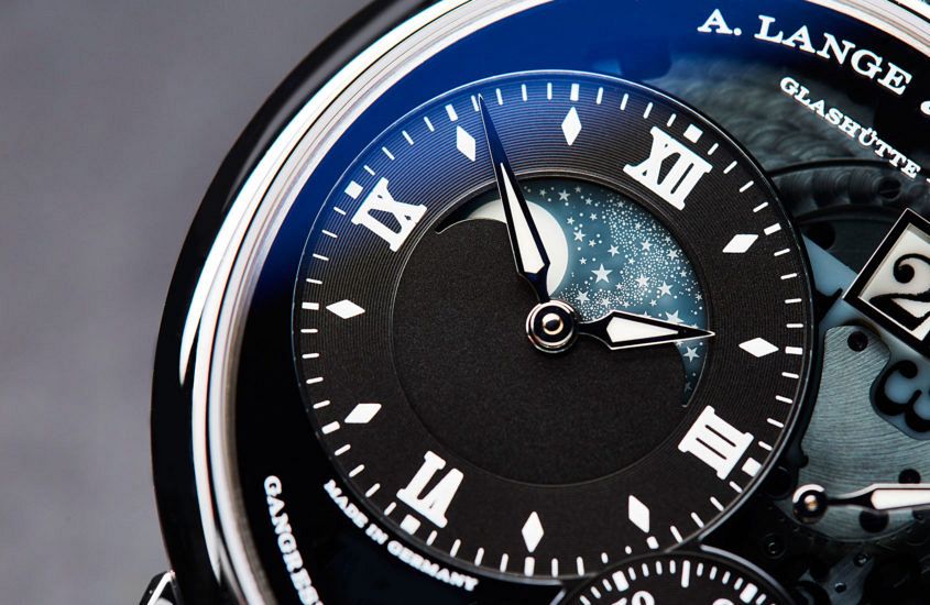 Think of Lange’s colour palette and the word ‘sober’ probably springs to mind. Or restrained. Limited. Calm. Muted. Subdued. Discreet. Anything but vivid and daring. Now, let’s for a moment think not of A. Lange & Söhne but only of the colours: white, black, grey (dials); black again, brown, (straps); pink gold, white gold (platinum looking more or less the same), a rare dash of yellow gold. Yes, there are some exceptions (we’ll come to those later), but put Lange’s entire catalogue of the past 20-plus years into a flip-book and that’s pretty much what you get. Based on those limited ingredients, if it were a cookery book you could be looking at the plainest meat-and-potatoes menu this side of a 1960s boarding school dinner. If it were another watch company … Well, sadly, the world is swamped with insipid, play-safe watches that are about as easy to distinguish from each other as boiled potatoes. But give those restricted ingredients to Lange and we get watches with richness and liveliness, with immediately recognisable character and great presence. It’s a remarkable trick. How does Lange do it? Let’s look back at the ‘famous four’ watches that announced the rebirth of the…
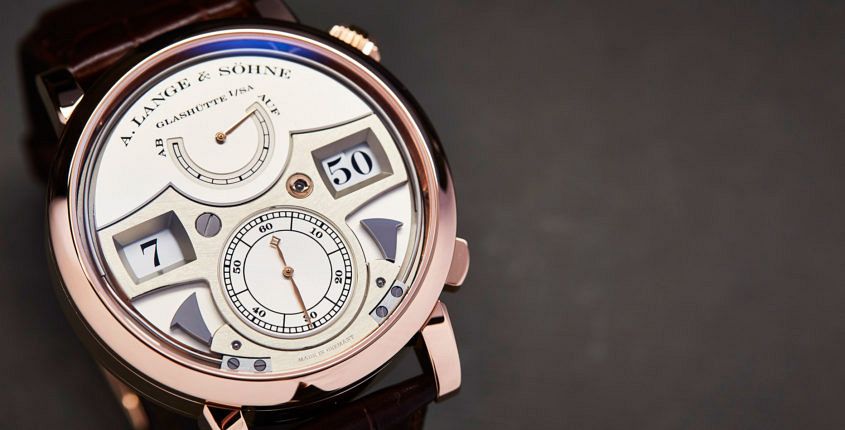 “Money likes silence.” Several years ago, a Russian collector by the name of Nikolai (he prefers not to publish his surname) was telling me why he’s so keen on A. Lange & Söhne, and I was struck by that part of his reply. While he meant it to sum up the ‘stealth’ appeal of Lange’s designs (discreet elegance; the antithesis of vulgarity), it also begged the question: what does make Lange so distinctive? A. Lange & Söhne is not what we think of as a “design brand” (the term suggests something altogether more conspicuous or self-consciously groovy) and yet its design language is not only unmistakable but also an intrinsic part of its being. We live in the Age of Noise: advertising noise, entertainment noise, social media noise – all adding to the general cacophony of daily living. So, given that a Lange watch announces its specialness with a whisper, not a shout, how does it make itself heard? The very quietness of Lange’s design is the answer, I think. A couple of years ago, Paul Tange, a prominent Tokyo-based architect and keen Lange collector, summed up the beauty of Lange’s design to me in the simplest terms: “Aesthetically, the…
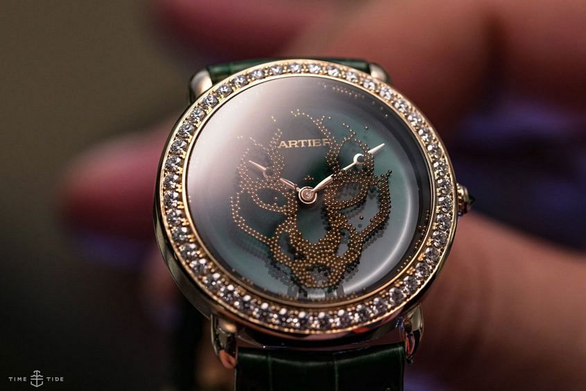 Visiting Cartier at SIHH is always an experience. Not only does the floorspace of the maison’s booth outstrip that of any other, but there’s always a sense of effortless cool, matched only by the sort of self-assurance that only comes from having been masters of your craft for a long, long time. Cartier Santos de Cartier Take, for example, the Cartier Santos. The watch, which lays claim to being the first modern wristwatch, was born in 1904, and is wearing its age well. This year, Cartier gave the model some smart, user-friendly upgrades – most notably the QuickSwitch strap changing system. Thankfully, these changes don’t mar the purity of the Santos case, which has received only minor ergonomic updates and subtle changes to the proportions of the bezel. Cartier Santos de Cartier Skeleton Cartier is well known for their skeletonised watches, so it made perfect sense for the Santos to get the stripped-down treatment. Offered in steel and pink gold large versions, this Santos, with its architectural Roman bridges, is an entirely more modern proposition. Cartier Révélation d’une Panthère Watch Seeing this watch for the first time was one of the real ‘wow’ moments of SIHH 2018. An entirely new…
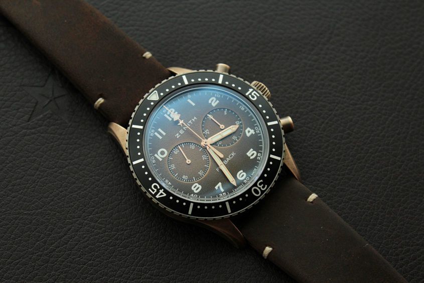 There’s no denying how many of us are often frustrated by the frequent “mild updates” launched by brands — new dial colours, new case and bezel materials, and the like; however, this year in Geneva, Zenith were one of the few to do so with such thoughtful execution that we couldn’t not make it a point of discussion. Yes, we’re talking about the beloved Cairelli chronograph reissue, the Pilot Cronometro Tipo CP-2 Flyback, unveiled in bronze (as well as aged steel) for 2018. Bronze continues to gain huge traction in the “accessible luxury” segment, and having first capitalised on the trend in 2015 with the bronze Pilot Type 20, creating a bronze CP-2 was a logical choice. Surprisingly, one of the key selling points of the new CP-2 Bronze Flyback Chronograph has nothing to do with its sexy new casing. For 2018, Zenith decided to up the ante by fitting the piece with its El Primero 405B caliber: an automatic column-wheel chronograph movement with flyback function, and a 50-hour power reserve. In celebration of this upgraded caliber, Zenith have fitted the new model with a sapphire display caseback, allowing its new owners the opportunity to admire the brand’s longstanding technical…
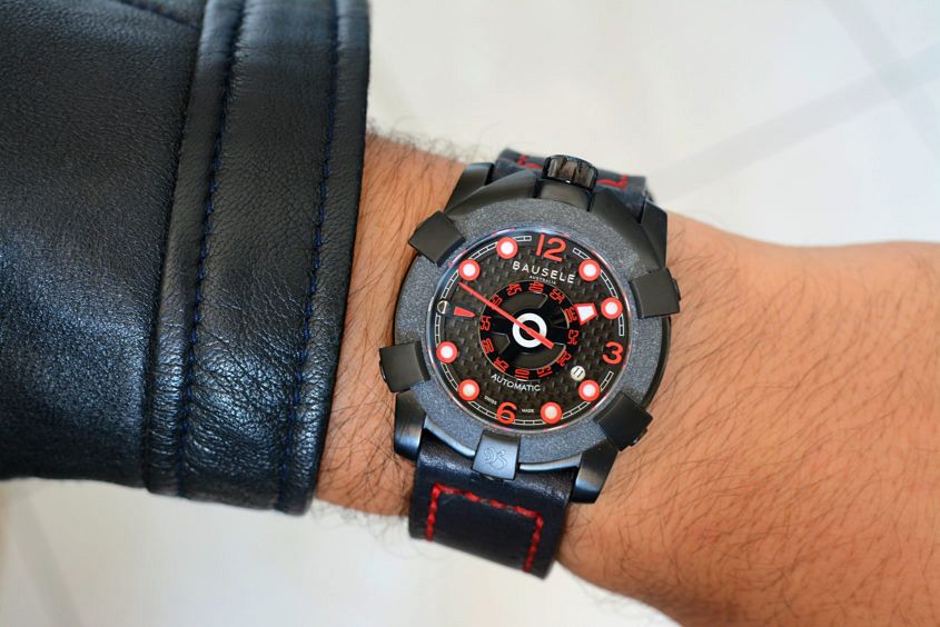 When Felix first took a peek at the Terra Australis made by Aussie watch company Bausele, what he saw before him – to paraphrase his own words – was the preliminary sketch before the finished painting. Fast-forward to today and those metaphorical pencil marks are now barely visible under brushstrokes of paint, with the brand officially launching the flagship model late last year. While much of the design hasn’t changed from that first look prototype, from initial impressions, it’s easy to see that the overall quality of finish has improved by leaps and bounds. To kick things off, Bausele have four special versions of the Terra Australis available. Limited to 50 pieces each, all with varying colour combinations for their five-pronged outer case, dial, hands, and strap. However, if that isn’t enough, customers can individualise their very own version on the Bausele website. With 850 different combinations possible. One of the initial four versions is this variant, dubbed the “Red Back”, with its blacked-out styling and not-so-subtle pops of white and red, demanding attention. Eagle-eyed viewers of TV series Prison Break may have already spotted it on the wrist of brand ambassador Dominic Purcell’s character Lincoln Burrows in the recent…
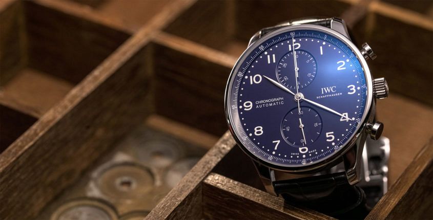 IWC’s Portugieser line is, in Australia at least, one of their most popular — and, of all the models, one of the perennial favourites is the classically handsome Portugieser Chronograph. Which is why we’re particularly interested in the Portugieser Chronograph Edition “150 Years”. Quick recap in case you’ve been living under a rock for the last week or so: This year, IWC turns 150 (and we don’t mind saying that they’re looking quite good for their age), and one of the ways they’re celebrating the big occasion is with watches. Specifically, 27 special limited editions, released across five key lines. Now, the Portugieser Chronograph may lack the high-end clout of the Constant Force, or the novel display of the Pallweber, but it is, nonetheless, an important model. Like all the models in this jubilee collection, the chrono is offered in two special, heavily lacquered dials in blue or white that do a fine job of evoking the look of enamel. There are not precious metal options; only steel, and both come on a black alligator strap. So, nice dial aside, what makes this watch special? Well, the movement. Typically, Portugieser Chronos have closed caseback, as they’re powered by a Valjoux. Not…