Value Proposition – Martenero Kerrison – A Stylish and Affordable Automatic All-Rounder
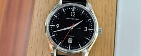
While a growing list of microbrands are producing well designed, high-quality watches that are nipping at the heels of brands like Hamilton, Tissot and Seiko, they don’t have the marketing or mass production prowess of those established brands. Some of the watches themselves, however, are bonafide contenders. Martenero is a young microbrand based in New York that already has a handful of intriguing lines in their portfolio. They recently funded a sequel to one of their bestsellers on Kickstarter, the Edgemere Reserve. It follows the original Edgemere and adds three complications, a 24-hour sub-dial, date and reserve indicator (the original Edgemere was a time-only piece). One of my favorite Martenero lines is the Kerrison, which is clean and conservative, but also full of personality. They remind me of the Three Hand Automatics from another young microbrand, Farer Universal. Both use splashes of color to add a little fun to otherwise subdued (yet stylish) dials. Let’s take a closer look at the Martenero Kerrison in black.

 There are a lot of things I love about Hublot, and I’ve got to say, this watch manages to cram pretty much all of them (barring ceramic) into one awesome, 45mm package. It’s the Big Bang Tourbillon Power Reserve 5 Days Sapphire Rainbow, and it does pretty much what it says on the tin. Let’s start with the case. Hublot has been playing with (and seriously democratising) ultra-hard, ultra-slick and ultra-cool synthetic sapphire cases since 2016, and it’s become something of a staple in their higher-end limited editions. For all its transparency, this 45mm wide and 14.25mm thick case has stacks of presence, providing an almost unbearably crisp, sharp silhouette. The incredible wrist presence provides an amazing juxtaposition with the transparent nature of the material. But in a twist that’s exclusive to the Australian and Japanese markets, Hublot has brought the rainbow heat to the equation, with a bezel stunningly set with 48 baguette-cut stones, arranged in a vivid, cascading rainbow. Ordinarily, the sapphire and rainbow combination would have had me swooning, but the movement takes it to the next level. It’s not a chronograph, but it is a tourbillon — a manually wound one with a hefty five days of…
 Seiko’s Astron (the new GPS one, not the groundbreaking quartz one) is a pretty incredible piece of kit. Ostensibly, it tells the time, day, date and a second time zone. But the trick is in the method. The Astron, thanks to GPS technology, keeps track of time by talking to satellites — a quite cool party trick. Given its go-anywhere accuracy and automatic time zone adjustment, it makes sense that the Astron is billed as an adventure watch for the travelling set. And never has that been more apparent than with this watch. Don’t mind the ‘Solar Executive Sports Series’ name, this watch is, in fact, the most rough and tumble Astron yet. The incredible versatility of the solar 8X53 is matched by the super-hard titanium case (with rose gold tone in this case) and ceramic bezel. The rich, golden brown ceramic bezel, by the way, is inlaid with UTC times on the top and IATA codes on the side, all of which, in a neat trick, have some impressive luminous powers. The shape of the case is more streamlined, too, a more rugged sporty look that downplays the still hefty 46.7mm diameter and 14.5mm height. Best of all, though,…


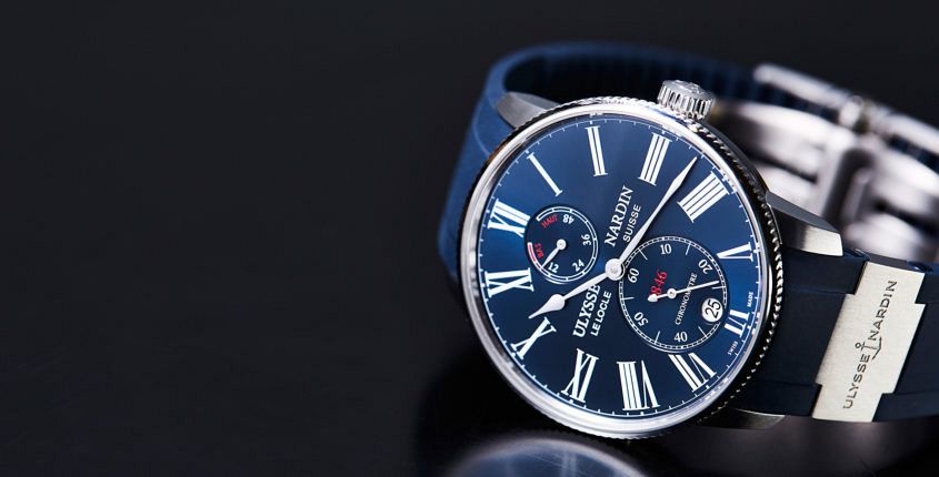
 It’s fair to say that there’s a fresh new breeze blowing in Ulysse Nardin’s sails these days. There’s a new energy, which has resulted in some great new designs, and refreshed takes on old classics. Case in point is the Torpilleur, a marine chronometer styled watch, which takes its name — appropriately enough — from agile torpedo boats. It’s a watch we’ve looked at before, but the latest configuration is, if you’ll pardon my colloquialism, freaking hot. The blue dial is rich and satiny thanks to the starburst finish, crisply painted with white Roman numerals. The dial layout is neat, with power reserve up top, and seconds (with a smoothly integrated date) at the bottom. The notched bezel adds some texture and dynamism to an otherwise pretty classic 42mm case. Some of the other interesting design elements are the numbered plate on the left-hand flank of the watch, as well as the trademark metal link in the sporty rubber strap. A strap that, it must be said, completely changes the mood of the watch, which I’ve previously seen only on croc. The movement is about as in-house as it gets, all the way down to the silicon hairspring and escapement,…
 The story in a second: It’s big, it’s complicated, it’s bloody clever. I’ve said it once and I’ll say it again: I’ve got a real soft spot for German watchmaking, but especially for Glashütte Original. Underappreciated, and painfully under-marketed anywhere outside of Europe, they are one of VERY few brands that manufacture their own dials and cases (in a separate facility in Pforzheim, not in Glashütte proper). Over the years, things like the ’60s and ’70s collections have consistently grabbed my attention, as did last year’s steel versions of the Senator Chronograph Panorama Date, but in 2018 something slightly outside my usual lines of watch attraction caught my eye — the large, somewhat traditionally styled, yet uniquely configured Senator Cosmopolite in steel. This steel version arrives three years after its initial launch in gold, and cuts its retail price down a fair bit (20,700 euros versus 38,000). As a world timer of immensely practical design from a technical standpoint (more on that later), there’s an appreciable shift towards functionality with the inclusion of a steel case that just makes sense with this watch, which is precisely why I was eager to give it some wrist time for a more in-depth…