IN-DEPTH: Perfectly suited to summer – the IWC Portugieser Yacht Club Chronograph
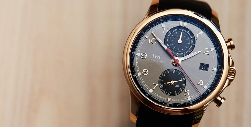 The story in a second: The sportiest member of the Portugieser family is busy living its best life. IWC’s Portugieser family is, large diameter aside, a fairly dressy affair. Classic style, leaf hands, all that jazz. It’s the classic business watch. Except, of course, for the Portugieser Yacht Club Chronograph, a watch that is business casual at best. The Yacht Club Chronograph is a timepiece in tune with its fun side, the sort of watch that can transition seamlessly from business to party. And looks great doing it. The dial Slate grey, which is the formal name of this dial, hardly sounds exciting. But the proof, as they say, is in the pudding. This dial is rich in detail and generally stunning. While the base of the dial is a rich slate sunburst, it’s all the other rich details that take it to the next level. The applied golden Arabic numerals, the printed white railroad chapter with luminous dots every hour, the deep black chronograph registers, and the classic leaf-shaped hands, which are — unusually for a Portugieser — filled with luminous material. I’m also quite partial to that red chronograph seconds hand, though I’d happily do without the ‘Yacht…
The post IN-DEPTH: Perfectly suited to summer – the IWC Portugieser Yacht Club Chronograph appeared first on Time and Tide Watches.
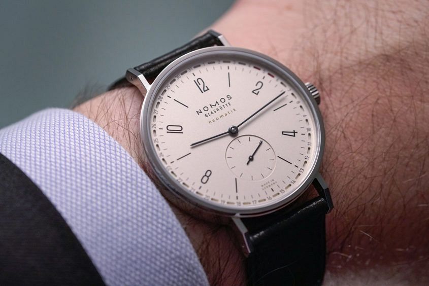 Surely there is no more contentious complication in the world of watchmaking than a seemingly humble date display? It’s hard to believe that something so useful, and seemingly ubiquitous, can be so divisive. One way to end the date/no date feud is to include it, but with a twist. And a twist is certainly what the Tangente neomatik 41 Update offers. The date is shown in the radial fashion, at the outermost extremity of the dial — already alleviating the issue of a dial-disfiguring date window, and working with the Nomos’ signature pared back vibe. And the Tangente, with its ultra slim and super subtle, serif-y Arabic numerals, is the purest and most pared back of the lot, even when it’s the larger 41mm version. Back to that date, though. It’s not as simple as being a radial date; you’ll notice that the date is indicated by being bracketed between two little lozenges of red, proving that a little bit of colour goes a long way. It’s a neat implementation to be honest, which allows the radial date to occupy a fairly narrow amount of real estate (less than putting a coloured aperture above or below a number), and maintains…
 Few colours have the symbolic weight of black. It’s meaningful in pretty much every culture. It’s associated — naturally enough — with darkness, mourning and solemnity, and with endings and beginnings. It’s also a colour of power and authority. All these associations and emotions are tied up in Moser’s latest conceptual piece, the Endeavour Perpetual Moon Concept Vantablack. Before we get to the greater meaning of this watch, let’s talk about the purely physical: steel case, 42mm wide, in the characteristically scalloped Endeavour case. A broad exhibition caseback shows off the HMC 801, manually wound, equipped with Moser’s interchangeable escapement and good for seven days of wind as shown on the indicator on the caseback. The strap is black alligator. All this has been seen before. What hasn’t been seen is the dial. Black, and stunning in its absence. Four hands sit upon a void of nothing. Hours, minutes and seconds marking time against an index-less dial. The stubby fourth hand serves as a day/night indicator, which you might think is redundant on a single time zone watch. But this little hand serves a purpose — accurately setting the phase of the moon. A moon that shows its face at…

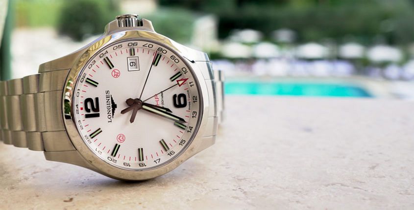 A few weeks ago I travelled to Rome to check out the Longines Conquest V.H.P. GMT Flash Setting, a GMT not like any other. And in between the first-look video, horse racing and spectacular rooftop launches, we thought we’d do some sightseeing around Rome and put the V.H.P. GMT through its paces as a travel watch. Now, of all the ‘genres’ of watches, the travel watch is one of the most subjective. There’s no handy ISO standard to hold it against, nor is there a clearly established design tradition. There’s only subjective taste. With that little caveat out of the way, I’d be quite comfortable putting my money where my mouth is and saying that this Longines Conquest V.H.P. GMT Flash Setting is a near-perfect travel watch for the 21st century. Why? Well, first of all, it looks good. It’s stylistically versatile — important if you’re on the road with one watch and need it to cover a range of sartorial duties. It’s also not too flashy. I don’t know about you, but I don’t want to be traipsing strange corners of the globe, in unfamiliar places where I don’t speak the language, in a watch that might stand out…
 Story in a second: The much-loved diver just got a serious makeover. Omega’s Seamaster Professional 300M is a true legend of the watch world, a watch that will be eternally associated with Bond – specifically Pierce Brosnan, the Bond who brought the franchise out of the wilderness, and once again into the spotlight. Like I said – legendary. And, as everyone knows, you don’t mess with legends. So I can only imagine that the pressure must have been high in the Omega product department in the lead up to the 25th anniversary makeover of the line, released earlier this year. And, broadly speaking, the refresh is restrained and balanced, providing upgrades where needed, but otherwise keeping the key elements right where they are. The case One of the most heated reactions to the ‘new’ Seamaster Professional was the size increase. Though really, it’s pretty marginal: 42mm, up from 41. Personally, I think the difference is minor and subtle, in keeping with what people who are after a contemporary daily dive watch want. However, while the cut-and-dry specs increase is the most obvious change to the case, it’s far from the only one. The helium release valve (that extra crown at 10…