IN-DEPTH: Luxury sports done right – the Zenith Defy Classic Skeleton
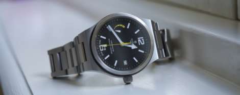
 The story in a second: Contemporary design and classic size make this a winning combination. It’s no secret that the Defy is Zenith’s darling this year. Baselworld 2018 saw them release a swag of different versions, including the crazy Zero G, the impressive chronograph, and this watch, the comparatively simple Classic. And while it may lack some of the fancy functionality of its bigger brothers, for me the Zenith Defy Classic – particularly this open-worked dial option – is the real winner. The dial You have to start with the dial, don’t you: a modern open-worked number with a bold star motif, inspired indirectly by the brand’s star logo, and more obviously by the epic Defy Lab limited edition from last year. And while these sort of dials tend to lean towards illegibility, it’s not really an issue here, as the quite large, lumed hour markers are anchored by the contrasting colour of the outer chapter ring, and the hands are bold enough to stand out against the busy background. The date at six (and indeed the whole date wheel) does get a little lost, though, and frankly I think that’s more of a pro than a con, blending seamlessly…
The post IN-DEPTH: Luxury sports done right – the Zenith Defy Classic Skeleton appeared first on Time and Tide Watches.


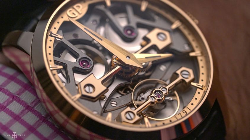 One of Girard-Perregaux’s leitmotifs is the golden bridge. Typically deployed in a trio, the golden bridges — with their broad, arrow-headed shoulders and pleasing, perfectly aligned symmetry — have been holding the brand’s wheels and balances in place since 1860. The golden bridges first showed up in a wristwatch in 1981, and these days it serves as a de facto logo. Girard-Perregaux has also been playing with tradition, with their modernist neo-bridges watches and this new, more accessible model, the Classic Bridges, which sees two bridges take pride of place on the dial; the smaller of the two looking after a balance wheel instead of the loftier tourbillon. That’s not to say that the Classic Bridges isn’t an impressive piece — this 40mm version (there’s also a suitably more epic 45mm option) is pure flex, with a large, no-nonsense pink gold case, and exceptionally finished, partially openworked dial. The satin polished steel components provide a nice contrast to those bridges and the broad, brushed hour and minute hands (there’s no seconds hand). The combination of contrast and power is compelling enough, but for me it’s the balance of the in-house movement that takes the Classic Bridges to the next level. The bridges are…
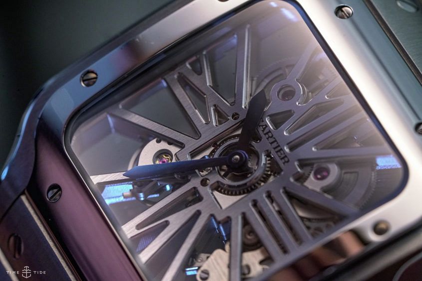 Last week we had a look at the ‘regular’ version of Cartier’s updated Santos, and today the less-is-more Skeleton is under our lens. To be specific, we’re talking about the large steel model (though there’s a pink gold version as well), which comes on the QuickSwitch and SmartLink equipped steel bracelet, replete with those prominent screws — you also get an additional alligator strap, allowing you to change your look should the fancy take you. So far, so standard for the new Santos. But what’s special here is the dial, or lack thereof, as you would expect. The manually wound 9611MC movement has been designed from the ground up as a skeleton movement, a process that means the architecture has been designed for maximum visual impact — the bridges have taken the form of Cartier’s iconic exploding Roman numerals; a pleasing blend of negative space and mechanics. And while the stripped-back style of the skeletonised Santos might not be to all tastes, it’s an important skill in Cartier’s history, and there’s no faulting the execution here.
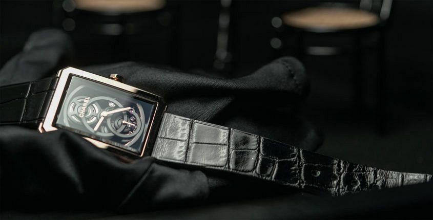 Gender-fluid. If you were born yesterday or became acquainted with pop culture only last year, you could be forgiven for thinking – based on the excitable talk among style-and-social commentators – that it’s a newly minted concept. Not so. The 1970s: boys wearing their hair longer than girls; 1966: Yves Saint Laurent’s Le Smoking … and so on, back through time. And watches: Cartier’s Tank, Rolex’s Datejust and Day-Date – those designs were always androgynous. And so to a watch that easily makes my Top 10 for the year: Chanel’s Boy.Friend Squelette or Skeleton if you prefer. Intentionally gender-neutral, it’s pitched as a women’s watch but it’s a world away from girly. And it’s equally far from butch: its Y chromosome is expressed as a very Parisian and urbane type of masculine elegance. The lines of the octagonal case – more accurately, a rectangle with its corners clipped off – is derived from Chanel’s first watch, the Premiere, but in Boy.Friend mode (which first appeared in 2015) the lines look tauter and sleeker. That’s largely thanks to its stepped bezel and svelte dimensions – the Squelette comes in at a shade under eight-and-a-half millimetres thick. Held inside that frame is a…