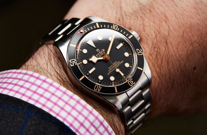
 Editor’s note: Someone I know is in the process of looking for a new watch – a Breitling Aerospace to be specific. Now, on first glance, this weird old ana-digi watch might not have much going for it, but, really, for a watch so light, this watch packs a big punch. And you know why? Well, I don’t want to give the game away, so read on … Case profile. There, I said it. It might not be as sexy as the movement or the dial, but in terms of real-world user-friendliness, it’s the kingmaker or deal-breaker. The problem is, watchmakers and fans are conditioned to a very top-down visual approach of watches. Look at any brand’s site, or most of the watches on Instagram, and what do you see? Dials. A whole lot of dials. And, honestly, it makes sense. The top-down dial shot encompasses most of what a watch is about. The dial is the visual star, and a typical wrist shot at least gives you some sense of what a watch looks like on the wrist, but it doesn’t really give you any sense of what it’s like to wear a watch on the wrist, because —…
The post EDITOR’S PICK: The most overlooked element in watch design appeared first on Time and Tide Watches.
Continue reading ‘EDITOR’S PICK: The most overlooked element in watch design’