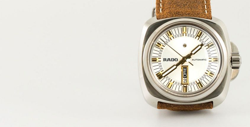
 When our good friend Justin Mastine-Frost was assembling his lists of last year’s best watches at various budgets, one entry in the 3-4k category sprung out – the Hyperchrome 1616. And no, not just because of how huge it is. The reason it stood out is because it challenges many of the stereotypes and preconceptions about Rado watches. When I think Rado, I immediately visualise sleek, thin cases, instantly recognisable thanks to the opalescent sheen of ceramic. Well, the 1616 is none of those things, but that doesn’t mean it’s not Rado to the core. You don’t have to be an expert to realise that the 1616 is inspired by the ’70s, an era where the prevailing attitude to watch design was the bigger and bolder, the better. Its muse is a watch called the Cape Horn, which had a distinctive shape with the same sort of rounded-off square case that we see here. Rado has taken this silhouette and run with it, bumping up the size to a highly polished 46mm that will not go unnoticed on your wrist. You’d be forgiven for thinking it’s polished steel but in fact it’s a specially treated titanium which makes it almost as scratch-resistant as ceramic. So even on this ostensibly heritage-styled…
The post HANDS-ON: Retro Rado – the funkadelic HyperChrome 1616 appeared first on Time and Tide Watches.
Continue reading ‘HANDS-ON: Retro Rado – the funkadelic HyperChrome 1616’