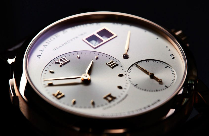
 There are few dials as instantly recognisable in the world of modern watchmaking as that of the Lange 1. This circular watch, with its off-centre hours and minutes dial, subsidiary seconds, power reserve and that instantly recognisable big date. In the opinion of Caragh McKay, watches and jewellery director at Wallpaper* (and founder of McKay Gurney), this distinctive dial is a real classic. “The Lange 1 is the core model for me … the codes are such – clean, big, sublime finishing – that you’d always recognise a Lange design across a watch-crowded room. I’m always drawn to the sheer clarity of their dials – the proportions seem slightly out of kilter, but work as a whole.” A modern icon then? Well, the ‘i’ word is a loaded one in watchmaking, prone to hyperbole and abuse. Anthony de Haas, Lange’s Director of Product Development, has issues with it: “People say we design icons, but we don’t. By definition, that is not possible. If a watch becomes an icon it happens over time – or it does not. The most we can do is have a good feeling about the design.” And while it’s hard to disagree with de Haas’ sentiment,…
The post INSIGHT: Designing A. Lange & Söhne – part 2, the detail in the dial appeared first on Time and Tide Watches.
Continue reading ‘INSIGHT: Designing A. Lange & Söhne – part 2, the detail in the dial’