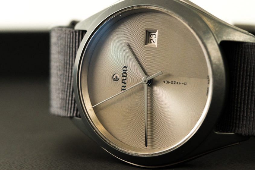
 When I opened the box in the hotel room, after arriving in Queensland for the Rado-sponsored Brisbane International tennis tournament, I was taken aback. This was not the watch I was expecting. Perhaps years of indoctrination and the current advertising campaign – with a ball bouncing around in a 3D model of a Match Point dial – made me assume it would be a Hyperchrome chrono of some kind, but nevertheless it was a pleasant surprise. Considering the program includes actually playing tennis and that my suitcase was full of laid-back summer clothing, a simple, ultra-light (the name does not lie) three hander on a grey canvas strap was just right. My first impression was… What? This is Rado? Although we shot this watch at Basel 2016, it had slipped under my radar. A closer inspection revealed a very cool concentric engraving pattern on the dial and the trademark ‘floating’ logo; some nice nuances to the overall sporty, simple design. Once I put it on I felt… Comfortable. This is a watch that’s extremely light, but not unsubstantial; it’s still solid enough. The light ceramic case construction and canvas strap make it extremely comfortable and appropriate for summer, when bulky clothes and bulky watches…
The post MY WEEKEND WITH: the RADO Hyperchrome Ultra Light Limited Edition Automatic XL appeared first on Time and Tide Watches.
Continue reading ‘MY WEEKEND WITH: the RADO Hyperchrome Ultra Light Limited Edition Automatic XL’
