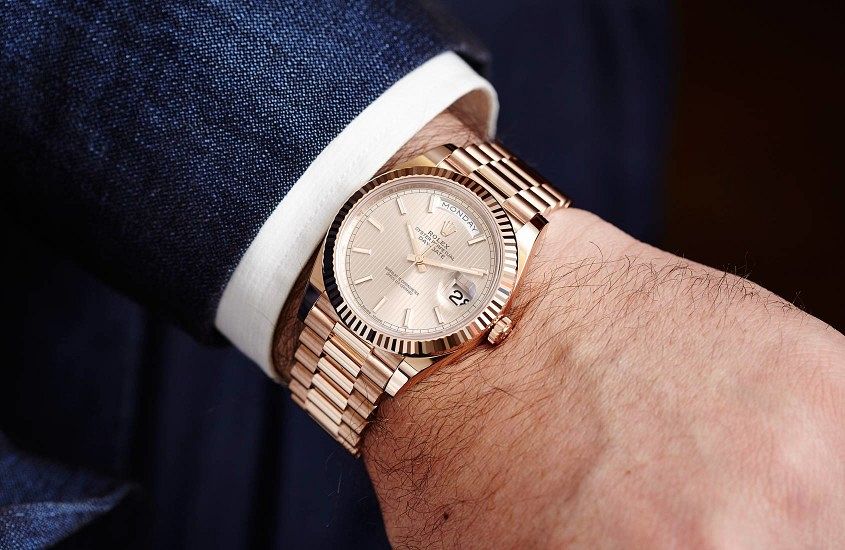
 Case profile. There, I said it. It might not be as sexy as the movement or the dial, but in terms of real-world user-friendliness, it’s the kingmaker or deal-breaker. The problem is, watchmakers and fans are conditioned to a very top-down visual approach of watches. Look at any brand’s site, or most of the watches on Instagram, and what do you see? Dials. A whole lot of dials. And, honestly, it makes sense. The top-down dial shot encompasses most of what a watch is about. The dial is the visual star, and a typical wrist shot at least gives you some sense of what a watch looks like on the wrist, but it doesn’t really give you any sense of what it’s like to wear a watch on the wrist, because —and this seems bleedingly obvious to state — a watch is a three-dimensional object. At T+T we’re pretty big on trying to get you as close as possible to what a watch is like IRL, which is why we spend a lot of time on our video reviews, and are occasionally guilty of the odd bit of wristroll spam. Because proportion matters, and in an age when we’re buying watches…
The post OPINION: Is this the most important (and overlooked) element in watch design? appeared first on Time and Tide Watches.
Continue reading ‘OPINION: Is this the most important (and overlooked) element in watch design?’