HANDS-ON: Vintage style, solid build and lume for days – the Ball Engineer Master II Skindiver II
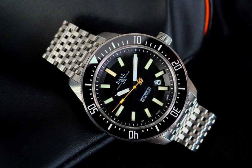 The watch industry is a well-oiled novelty-making machine. Every year it produces a sea of new releases that quickly turns the tide of attention from the old towards the latest and greatest in the world of watchmaking. Occasionally, though, it’s nice to stop and look back on the watches that we might have missed. Watches like this one: the Ball Engineer Master II Skindiver II. With a brand history that dates back to the American railroad in 1891, and more than a couple of technically nifty details, I quickly jumped at the chance to try one out in the metal. Vital statistics Released in 2015, the design of the Skindiver II is inspired by a 1962 version of the Ball Skindiver, retaining the classic look of the Skindiver case, and upsizing it to 43mm wide and 14mm thick. With the larger case comes an improved water resistance of 500 metres, as well as a helium escape valve, a shock resistance of 5000Gs, and an antimagnetic rating of 4800 A/m. However, the shining star is its multidimensional black dial and the 15 double-sized micro gas tubes that form the hour markers and glowing elements of the hands. Unlike a coating of lume,…
The post HANDS-ON: Vintage style, solid build and lume for days – the Ball Engineer Master II Skindiver II appeared first on Time and Tide Watches.
 Mido is a name that might not be too familiar to our Australian readers, as the Swatch Group brand has had the most minimal of minimal presences on our shores until recently. But as it so happens, they’re celebrating their 100th anniversary this year, and they’re doing it with a strong collection of watches, like this new GMT addition to their venerable Multifort line. The Mido Multifort GMT — offered in either steel with a black dial, or rose gold PVD with a blue dial — is a good-looking unit, 42mm across on a classically styled 22mm three-link bracelet on the black dial, or faux croc on the blue. The case is a dual crown affair, for fans of the Super Compressor style, with the lower handling the time setting for home and local times, while the upper looks after the sloped internal bezel which is marked with 24-hour indication in the familiar night/day colour scheme. The dial is really very pretty, with Mido’s characteristic and clever use of Geneva stripes (typically a movement decoration) as a dial decoration. It works really well, adding just the right amount of pizzazz. Speaking of movements, the top grade ETA 2893-2 movement (Caliber 1193 in…
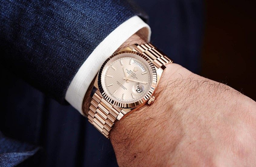 Case profile. There, I said it. It might not be as sexy as the movement or the dial, but in terms of real-world user-friendliness, it’s the kingmaker or deal-breaker. The problem is, watchmakers and fans are conditioned to a very top-down visual approach of watches. Look at any brand’s site, or most of the watches on Instagram, and what do you see? Dials. A whole lot of dials. And, honestly, it makes sense. The top-down dial shot encompasses most of what a watch is about. The dial is the visual star, and a typical wrist shot at least gives you some sense of what a watch looks like on the wrist, but it doesn’t really give you any sense of what it’s like to wear a watch on the wrist, because —and this seems bleedingly obvious to state — a watch is a three-dimensional object. At T+T we’re pretty big on trying to get you as close as possible to what a watch is like IRL, which is why we spend a lot of time on our video reviews, and are occasionally guilty of the odd bit of wristroll spam. Because proportion matters, and in an age when we’re buying watches…
 One of the Raymond Weil’s great strengths has always been stylish, sharp, everyday dress pieces, something that’s really epitomised in the Maestro line. Well, at Basel that line got a little bigger, with the addition of three new, blue-dialled options. These watches, like many things in the world of Raymond Weil, take their inspiration from the world of music — remember, the collection is called ‘Maestro’. But the Maestros we’re talking here aren’t your Chopins or Shostakoviches — no, as you’d expect, these blue dials pay homage to that most American of genres: blues. And while it’s a broad church, incorporating the haunting vocals of Billie Holiday, the visceral chords of John Lee Hooker, and everything in between, it’s a genre that is, at its heart, about emotion. And really, aside from the obvious blue connotation, these three watches do pull on the heart strings just a little. First of all, let’s look at the date version. Housed in a 40mm rose gold PVD case, the dial of this watch is a thing of beauty: the blue is dark and rich, caught somewhere between the deep sea and the sky at dusk. It’s made even more captivating by the mix…
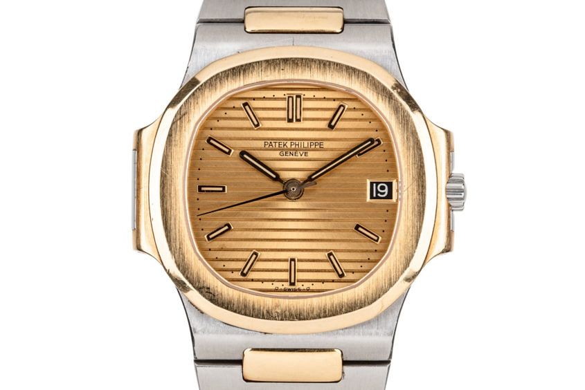 It’s no secret that the vintage watch market is booming. Take a peek at recent results from the big watch auctions by the likes of Phillips and Christie’s and you’ll see that prices are on the rise. Great news for those who have collections that are more akin to a retirement nest egg. But for us lesser folk who are just looking to find our way into the game, it’s becoming increasingly hard to find good value vintage timepieces. However, while the market may be dark and full of terrors, there’s still hope. Take two-tone, for example. Once trendy steel and yellow watches typically costing less than their all stainless-steel counterparts, their cool factor is finally on the rise again, making it the perfect time for bargain hunting. As always, when buying vintage, it’s wise to tread carefully. And the combination of steel and gold is not without its own pitfalls. With things to be aware of, like the dangers of gold plating and the obvious Patrick Bateman association. However, if you do your homework and can learn to embrace the two-tone, there’s still plenty of value to be found. Patek Philippe Nautilus 3800 A slightly smaller version of the…