HANDS-ON: Suit ready – the Panerai Luminor Due 3 Days GMT Power Reserve Automatic Acciaio – 45mm
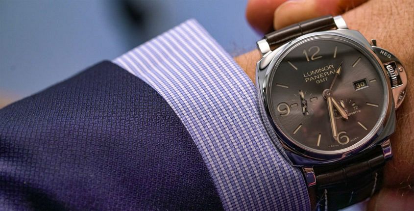 When it came to Panerai’s latest collection, we’ve already covered off how the Luminor Due was the surprise star. And while it’s fair to say the smaller models accounted for a disproportionate amount of the noise, there was strong representation at the larger end of the scales. In particular this watch, PAM 00944, a full-cream 45mm case, which — thanks to its Due status — still slips under the cuff with far more ease than its ‘regular’ Luminor brethren. And, to be honest, this watch is made with suits of the finer cut very much in mind. The polished 316L steel case is, well, polished in every sense of the word, and the croc strap with contrasting stitch is elegant in a way only alligator can be. Then there’s the dial. It’s still the familiar sandwich construction, with bold, stylised Arabic numerals at the cardinal points: a design that would very much be familiar to those wartime divers. But the execution is more civvie than military — not to mention civilised. The luminous material on the markers and hands, as well as the printed details all in a warm, butterscotch hue (quite pleasing); and the main dial material is a…
The post HANDS-ON: Suit ready – the Panerai Luminor Due 3 Days GMT Power Reserve Automatic Acciaio – 45mm appeared first on Time and Tide Watches.
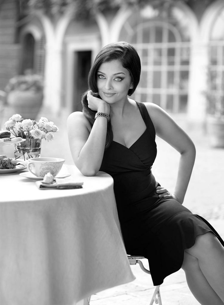 Time is a funny thing. The PR schedule was fast and furious when Longines Ambassador of Elegance Aishwarya Rai Bachchan held court at her Four Seasons suite during the afternoon prior to the Sydney opening of Longines’ flagship boutique. But sitting in front of the world’s most famous grey-green eyes, as they surveyed the harbour far below, time slowed. Mixing regal bearing with warmth, Aishwarya Rai Bachchan speaks in a considered, melodious flow. Most of the Australian pack wanted, of course, to ask for her thoughts on the #MeToo movement, a topic she politely addressed, but we felt we had to find out how she balances her international schedule. Evidently, hers is a demanding life. Bollywood icon, a mother to a young daughter, committed to various charity roles, and maintaining some very special brand relationships, like her 18-year Longines role. She laughed when the balancing act was raised, sitting perfectly poised in a sea foam-hued ball gown. “Someone was asking me earlier if I had to choose a Commonwealth Games sport, what would I choose. I said I think [I’d be] a gymnast. It’s very graceful and a beautiful sport, but every working woman would see herself as that.” Her…

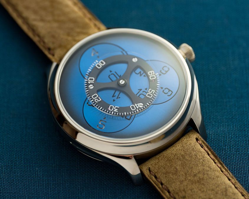 When you think of H. Moser, a select handful of words come to mind: classic, traditional and, of course, fumé. There’s also the other side of the business that loves taking potshots at the industry with its polarising marketing tactics (as we all saw once again during SIHH), but in the halls of SIHH our focus was set on the brand’s latest creation: the new Endeavour Flying Hours. Looking solely at its sleek case and the blue hue of its dial, the piece still oozes H. Moser design DNA; however, its time indication is something entirely different. Using a unique satellite-style time indication — one very reminiscent of the Urwerk UR-103, to be fair—this latest release came as a bit of a surprise. From a static first glance, it’s hard not to draw the Urwerk parallel, but seeing the caliber in action reveals a few significant (and needed) differences. Unlike UR calibers where the satellites orbit around the centre of the dial, the satellites of the Endeavour Flying Hours are fixed. Mounted on a round central bridge finished in black DLC, three funky blue discs are used to display the current hour. On a clear sapphire disc resting above its…
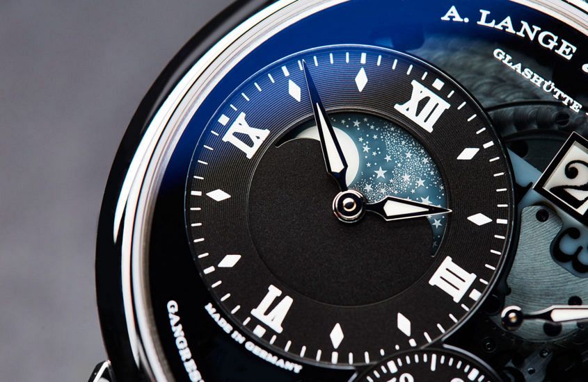 Think of Lange’s colour palette and the word ‘sober’ probably springs to mind. Or restrained. Limited. Calm. Muted. Subdued. Discreet. Anything but vivid and daring. Now, let’s for a moment think not of A. Lange & Söhne but only of the colours: white, black, grey (dials); black again, brown, (straps); pink gold, white gold (platinum looking more or less the same), a rare dash of yellow gold. Yes, there are some exceptions (we’ll come to those later), but put Lange’s entire catalogue of the past 20-plus years into a flip-book and that’s pretty much what you get. Based on those limited ingredients, if it were a cookery book you could be looking at the plainest meat-and-potatoes menu this side of a 1960s boarding school dinner. If it were another watch company … Well, sadly, the world is swamped with insipid, play-safe watches that are about as easy to distinguish from each other as boiled potatoes. But give those restricted ingredients to Lange and we get watches with richness and liveliness, with immediately recognisable character and great presence. It’s a remarkable trick. How does Lange do it? Let’s look back at the ‘famous four’ watches that announced the rebirth of the…