INTRODUCING: The Archimede Pilot 42 GMT – proven quality at a price that’s hard to beat
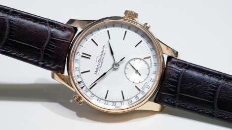
 German based Archimede is one of those small brands that quietly go about their business, sticking to their niche and making some excellent watches with minimal fuss. And while their catalogue offers a full suite of products, from dress to diver, it’s pilots that they’re best known for. And while Archimede’s design has evolved a little over the years, fundamentally it holds very true to the WWII-era aviator’s watches. The latest addition to the collection is a GMT, housed in a reasonably sized 42mm steel case that’s quite slim at 9.2mm thick. The second timezone is displayed via a red sword-shaped hand that refers to an inner 24-hour scale — a nice implementation that echoes the ‘Type B’ style of pilot’s dial. Powering this GMT is an ETA 2893-2, which is quite a solid offering at this price point, especially when you factor in the high quality of the case (side note: Ickler, the company behind Archimede is primarily a case manufacturer) and sapphire crystal. As you’d expect with a pilot’s watch, the dial is neat and clean with a well-finished date window at six and an admirably restrained amount of dial text. While the Archimede Pilot 42 GMT doesn’t break…
The post INTRODUCING: The Archimede Pilot 42 GMT – proven quality at a price that’s hard to beat appeared first on Time and Tide Watches.
 Way back in January, one of the watches we were most excited to see at the SIHH was Montblanc’s high-end, Minerva-powered 1858 Chronograph Tachymeter in bronze. Partially because it’s a hot watch and partially because of its extremely limited production (only 100 pieces) we thought this would be the only chance we’d get to try it on. Luckily though, Montblanc also took the opportunity to release some regular production bronze models which are equally awesome, but not in quite the same league as this Villeret piece. Make no mistake, the calibre MB M16.29 is the star here. The manually-wound monopusher chronograph movement is truly one of the nicest in the business. With its traditional architecture and column wheel layout, little has changed to its design or production since the 1930s. In fact, the only thing that’s new are the red-gold coloured movement components that are a perfect match for the case. And while it might be reasonable to assume that the case is the most noticeable feature of this watch, the biggest takeaway for me isn’t the case per se, but how the whole watch comes together as an exercise in tonal complement rather than contrast. The bronze case, the starburst Champagne dial…
 Over the last few years, Panerai has gone to a lot of effort to evolve their offering. The foundation pieces are still there – aggressively simple dive watches that make little effort to belie their military origins, but these days the brand has so much more to offer, from hi-tech tourbillons to slender dress options. These two GMTs, released last year, are the kind of watches that bridge old and new. They’re undeniably Panerai, with the large 45mm Radiomir 1940 case and instantly recognisable combination of super-stylised Arabics and hash marks, but look closer and the changes are obvious too. The dial, for starters. No longer a simple matt sandwich, Panerai has added texture to the mix, with subtle Clous de Paris and vertical stripe finishes to keep things interesting. Likewise, the iconic luminous sandwich construction hasn’t been used here, with the ecru-coloured luminous material applied in the more traditional manner. As you can see, both these watches display a second time zone via the slender, arrow-tipped hand. This is a 12-hour hand, which is convenient for reading the second time at a glance, but less so if you have problems remembering if it’s day or night in that time…
 Editor’s Note: In the office there’s a bit of a running joke about my taste in watches – that I *only* like 36mm vintage pieces. And while I do own one 36mm vintage watch, the two watches I wear most often are 40 and 45mm respectively (both new, btw). I used to be much more into the old stuff, but these days not so much. When I first started getting seriously into watches, I was all about vintage. In my mind this is where it was at. I lusted after the IWC Mark XI, the Omega Memomatic and the Tudor Advisor. I’d wince when a brand ‘updated’ its icon, which invariably meant making it bigger, wider and to my eyes, uglier. With the rosy-tint of nostalgia for a life that was gone before I was born, I was sure perfection in watch design was reached in the pre-CAD times of the mid-’70s (it goes without saying that I thought the ’80s was a horological dead-zone full of quartz, Swatch and two-tone). Fast forward to today – I’ve learned a little more about watches, and have come to a realisation. I’m no longer a vintage watch guy. Don’t get me wrong,…