MY WEEKEND WITH: the RADO Hyperchrome Ultra Light Limited Edition Automatic XL
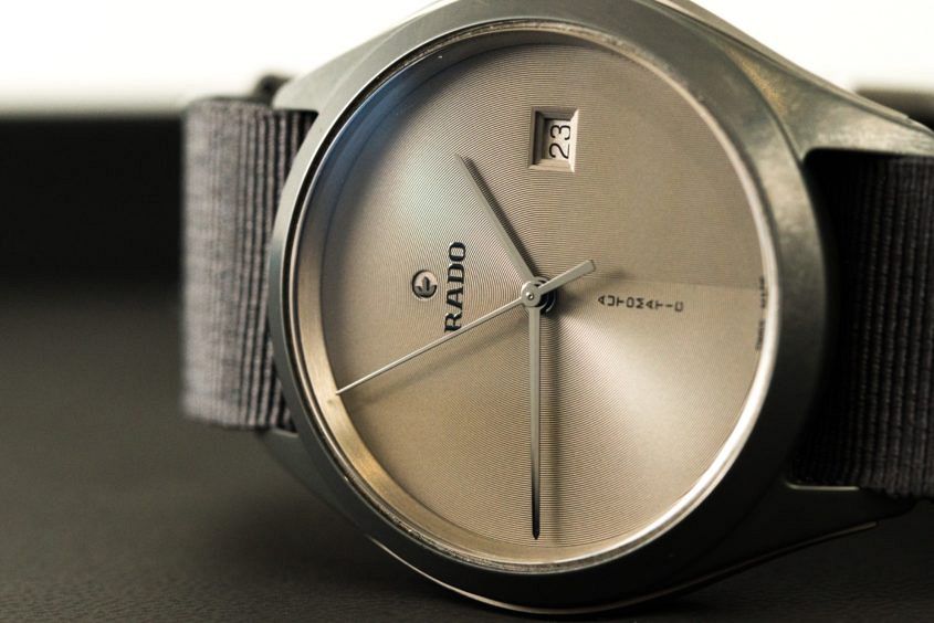
 When I opened the box in the hotel room, after arriving in Queensland for the Rado-sponsored Brisbane International tennis tournament, I was taken aback. This was not the watch I was expecting. Perhaps years of indoctrination and the current advertising campaign – with a ball bouncing around in a 3D model of a Match Point dial – made me assume it would be a Hyperchrome chrono of some kind, but nevertheless it was a pleasant surprise. Considering the program includes actually playing tennis and that my suitcase was full of laid-back summer clothing, a simple, ultra-light (the name does not lie) three hander on a grey canvas strap was just right. My first impression was… What? This is Rado? Although we shot this watch at Basel 2016, it had slipped under my radar. A closer inspection revealed a very cool concentric engraving pattern on the dial and the trademark ‘floating’ logo; some nice nuances to the overall sporty, simple design. Once I put it on I felt… Comfortable. This is a watch that’s extremely light, but not unsubstantial; it’s still solid enough. The light ceramic case construction and canvas strap make it extremely comfortable and appropriate for summer, when bulky clothes and bulky watches…
The post MY WEEKEND WITH: the RADO Hyperchrome Ultra Light Limited Edition Automatic XL appeared first on Time and Tide Watches.

 The cool and elegant Vacheron Constantin booth at SIHH was packed with highly complicated pieces (including the most complicated piece), and their top-line SIHH releases were a mass of brain-bending masterpieces, heavy on the sonneries, sidereal time and celestial maps. But amid all this mechanical splendour I found myself coming back to a simpler – but by no means simple – option: the Patrimony Perpetual Calendar, in a pink gold case with a new, slate grey dial. The colour combination is all that’s changed, but sometimes a fresh new look is all you need to fall in love all over again with an old favourite. Until now this distinguished 41mm watch (which is quite slender at 8.96mm) was available in pink gold with a silver opaline dial, or in platinum everything as a special Excellence Platine edition. Both watches were exceedingly formal takes on a traditional complication. Very Vacheron Constantin. This version, though, is much more contemporary in look and feel – you might almost say it’s trendy. The contrast between the warm gold case and the cool grey domed dial is to die for, and the way light plays across the myriad of polished surfaces is more than a little…


