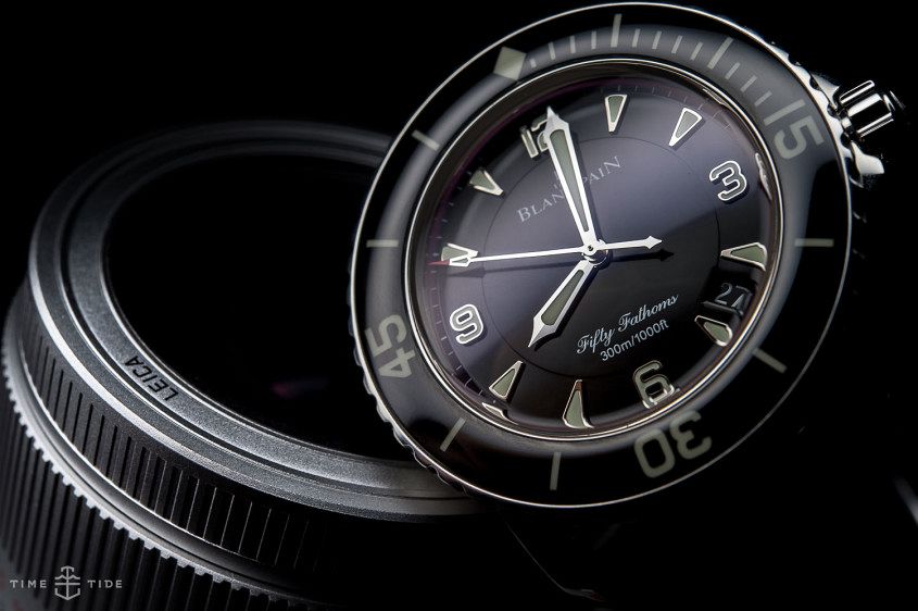
 It’s one of the original (if not THE original) dive watches – the Blancpain Fifty Fathoms. And since its introduction in 1953, it has proved to be a rugged and versatile design. Today though, the two main pillars of the Fifty Fathoms collection are the regular version, styled after that 1953 original, and the Bathyscaphe, which takes its look from the simpler, civilian version of the watch, first released in the ’60s. Given that this week has been all about the latest (and greatest) addition to the Bathyscaphe family on Time+Tide, we thought it’d be a good idea to compare this angular, stripped diver to its curvier sibling. Luckily we happen to have some truly sumptuous pictures of the Fifty Fathoms handy – from a photographic love letter penned by pro-shooter Kristian Dowling, who makes the FF look more beautiful than we’ve seen it before or since (seriously, hit the link and get ready to swoon). Rather than give you a blow-by-blow account, we’d prefer to let the pictures speak for themselves, with just a touch of commentary thrown in for good measure. The dial Fifty Fathoms: The dial of the original is a deep, glossy black – a classic, slightly vintage…
The post PHOTO REPORT: We compare the Blancpain Fifty Fathoms to the Bathyscaphe Ocean Commitment II appeared first on Time and Tide Watches.