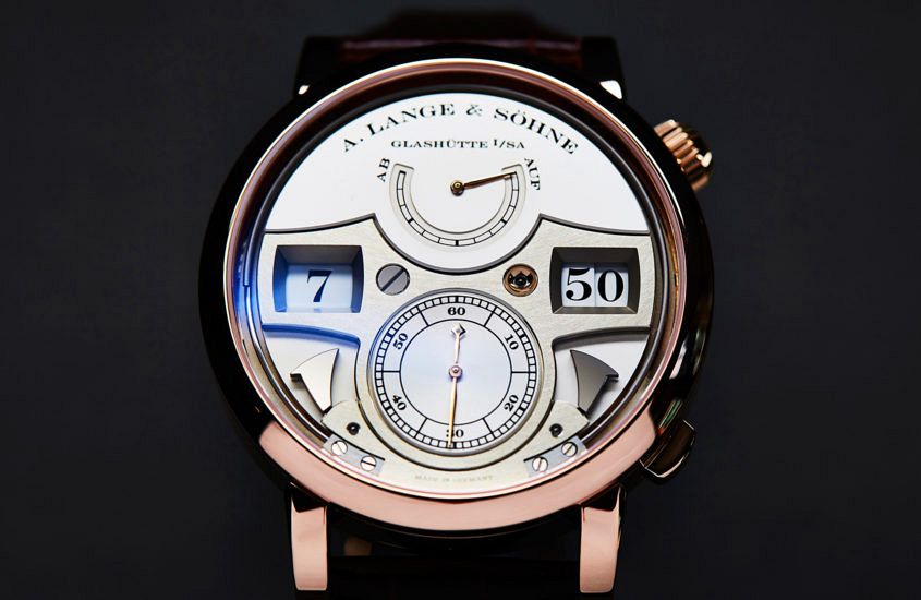
 Editor’s note: Some of my favourite stories on Time+Tide are the series we wrote on the design of A. Lange & Söhne’s watches. This first instalment, written by Sandra Lane, explores the German brand’s overall design methodology and approach. Well worth another read. “Money likes silence.” Several years ago, a Russian collector by the name of Nikolai (he prefers not to publish his surname) was telling me why he’s so keen on A. Lange & Söhne, and I was struck by that part of his reply. While he meant it to sum up the ‘stealth’ appeal of Lange’s designs (discreet elegance; the antithesis of vulgarity), it also begged the question: what does make Lange so distinctive? A. Lange & Söhne is not what we think of as a “design brand” (the term suggests something altogether more conspicuous or self-consciously groovy) and yet its design language is not only unmistakable but also an intrinsic part of its being. We live in the Age of Noise: advertising noise, entertainment noise, social media noise – all adding to the general cacophony of daily living. So, given that a Lange watch announces its specialness with a whisper, not a shout, how does it make…
The post The detailed design of A. Lange & Söhne appeared first on Time and Tide Watches.