EVENT: Bollywood royalty Aishwarya Rai Bachchan opens Longines flagship Sydney boutique
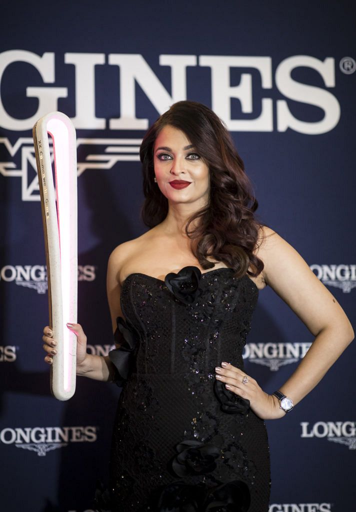 Wherever Aishwarya Rai Bachchan goes in India there is a monumental crowd surge, and it was no different in Sydney at the weekend when Longines launched their flagship boutique in Australia and celebrated their starring role in the upcoming Commonwealth Games. Some local Indian film fans had brought their entire clans and staked out a viewing spot when the Queen Victoria Building opened that morning, even though the superstar was not due to arrive until 6.30pm. The press scrum was on when the world-famous beauty made her entrance, flanked by intimidating security, followed by countless hands launching mobile phones high. But the crowd was in respectful awe; there was no pandemonium. As Longines’ Ambassador of Elegance welcomed her audience with the Hindu greeting, Namaste, the crowd listened intently to their icon. Alongside Juan-Carlos Capelli, Longines Vice President and Head of International Marketing, Rai Bachchan graciously held the 2018 Queen’s Baton aloft, after it was handed to her by Australian high jumper Amy Pejkovic. “The pleasure is all mine being here this evening,” she smiled. “Thank you Longines for having me enjoy this wonderful little adventure of receiving the Queen’s Baton. It’s been a privilege for me receiving the baton.” She…
The post EVENT: Bollywood royalty Aishwarya Rai Bachchan opens Longines flagship Sydney boutique appeared first on Time and Tide Watches.
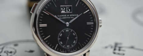
 Typography matters. The choice of font or type is a more complicated matter than merely the arrangement of letters used and the order in which they appear. It’s something designers and branding specialists know only too well: the sub-textual information communicated through the subtle language of serif, weight and kerning. Take the word ‘apple’, for example. Typically, that arrangement of letters evokes the fruit. Capitalise the ‘a’ and write it in Avenir, a font designed by Adrian Frutiger in 1988, and the meaning instantly morphs to that of the sleekly designed products of the Cupertino giant. The heaviness of this meaning is exacerbated when text is used as logo: think NASA, Coca-Cola or even Facebook. And so A. Lange & Söhne, written in that characteristic curve, which gently follows the line of a round case – surmounting the words Glashütte I/SA – has multiple meanings. A. Lange & Söhne indicates the brand, and the second line speaks to their home (the I/SA is shorthand for ‘in Sachsen’ or Saxony). Factual, literal stuff, but the font Lange have chosen speaks to their identity, and speaks to it in a very interesting way. A. Lange & Söhne is a brand with a…
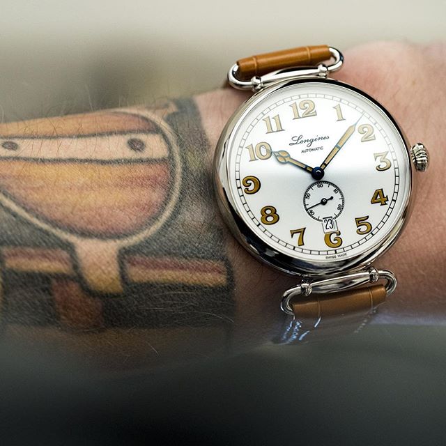 Editor’s note: Even though the dust of SIHH has barely settled, things are heating up for Baselworld. And one of our burning questions is … what awesome heritage piece is Longines going to pull from their archives? They’ve had a good run over the last few years, including this cracking take on a traditional trench watch – the Longines Heritage 1918. Justin Mastine Frost explains … There’s no arguing that the vintage reissue trend is still going strong, though this latest offering from Longines digs further back into the archives than we were expecting. Their newly unveiled Heritage 1918 draws on the brand’s early history, having a very early pocketwatch-conversion vibe to it that — though a little unconventional at first — has grown on us quickly, and reminds of the Longines Heritage Spirit. Its rich lacquered dial, contrasting honey-brown varnish painted numerals, and blued cathedral hands scream classic early 1900s watchmaking. Unlike the faux-tina lume we have seen from countless other brands in an attempt to appear aged, this paintwork feels much more honest and will no doubt go over well with those seeking a heritage piece that’s a little different to the mid-century style that’s so trendy at the moment.…
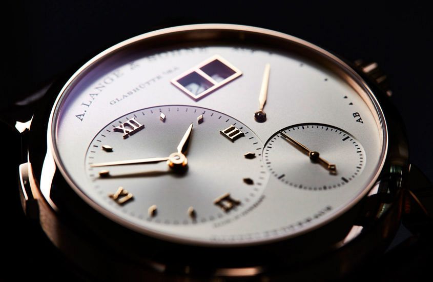 There are few dials as instantly recognisable in the world of modern watchmaking as that of the Lange 1. This circular watch, with its off-centre hours and minutes dial, subsidiary seconds, power reserve and that instantly recognisable big date. In the opinion of Caragh McKay, watches and jewellery director at Wallpaper* (and founder of McKay Gurney), this distinctive dial is a real classic. “The Lange 1 is the core model for me … the codes are such – clean, big, sublime finishing – that you’d always recognise a Lange design across a watch-crowded room. I’m always drawn to the sheer clarity of their dials – the proportions seem slightly out of kilter, but work as a whole.” A modern icon then? Well, the ‘i’ word is a loaded one in watchmaking, prone to hyperbole and abuse. Anthony de Haas, Lange’s Director of Product Development, has issues with it: “People say we design icons, but we don’t. By definition, that is not possible. If a watch becomes an icon it happens over time – or it does not. The most we can do is have a good feeling about the design.” And while it’s hard to disagree with de Haas’ sentiment,…
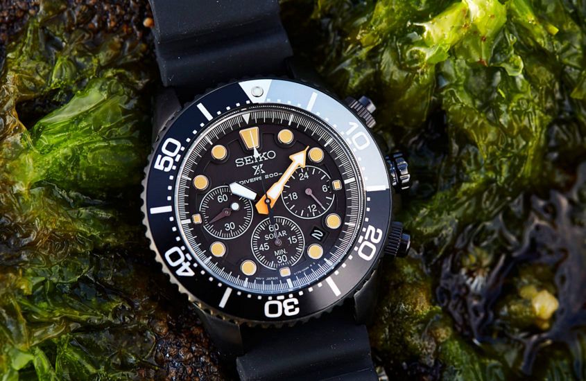 If you’re looking for a watch with bells, whistles and some serious style, you should probably check out this feature-heavy diver, the Seiko Prospex SSC673P. It’s part of a series of three limited edition blacked-out divers called — appropriately enough — the Black Series. The other watches are time-only affairs, in automatic and solar configurations, whereas this addition adds some complication to the equation. But first, the basics. With a substantial 43.5mm case, screw-down crown and pushers, and a broad black aluminium bezel topping off the fully black case, this watch clearly has a bold on-the-wrist presence. Add to that the incandescent orange hour hand and (slightly) more subdued burnt orange lume details and this watch has the style wars all but won. And then there’s the functionality. Not only is this watch a dive-ready chronograph (remember those screw-down pushers), it’s also a solar-powered beastie, meaning that — through the magic of Japanese technology — light is transformed into pure energy, which is cool! If you had to find fault with this watch, you could argue that there’s a lot going on with the dial — text, subdials and date. It’s got it all going on. But, for all that, legibility is…